
How to create your own website: Choosing web design for your site

Web design depends largely on taste, and tastes differ. However, it’s important to keep in mind a website’s primary function – to represent a business and provide information rather than serve as a piece of art or a compilation of our favorite colors. What you think looks great is not always what actually works best for you and your business.
That doesn’t mean that a website should be tacky or ugly. Put simply, the design of a website shouldn’t make it difficult to understand the information on it.
So what are the best practices of web design?
Considering the context, you’re most likely to choose a ready-made design and so your choice will largely be based on the layout, color scheme and images therefore that’s what I’ll be talking about. Of course, these basic principles also apply to cases when a design is created to order.
Classic layouts and menus work best
While sometimes it is tempting to choose exotic, impressive and flashy designs and non-traditional menu layout, most often the classic layout with clearly visible menu at the top, main content in the middle and footer at the bottom is what works best, because this is the scheme visitors are used to.
Since most visitors have only seconds to spend on your website, classic layout will ensure most of the time is spent on reaching your goals instead of figuring out how to use menu.
How to choose a good color scheme
Don’t have a professional designer on hand? Try to get by on your own! Here are some tips:
White background + black text + a single color = recipe for success
Your best bet is to stick with an age old and classic color combination such as black or dark gray text on a white background + one additional tone as a feature for the logo, links, buttons and other design elements.
The single tone strategy
If one single color seems too little and you’re keen for a more interesting solution, a good idea is to use darker and lighter versions of the same color. For example:

Borrowing a color scheme from an “expensive” website
Another good option is to borrow a color scheme from a big corporate website which has been expensive to build, or a professional design sample which you can find on websites such as www.themeforest.com.
Forget being an artist, use a template
When we’re buying a car, even if it’s a very expensive car, we usually choose one of the tones on offer by the maker. Does that make the car worse? I’d say it makes it better. 90% of the time, even if we have to pay more for an unusual color, we’re actually ruining it. Haven’t you ever seen a pink BMW?
It’s similar with websites. If you use an automated tool like Mozello to create your website, choosing a ready-made color scheme is a safe bet.
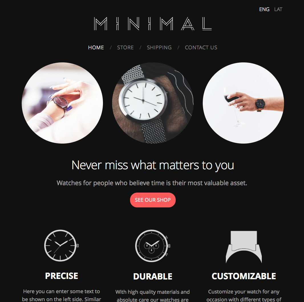
Black and gray go with everything
Combining different black and gray tones with one or two featured tones is a safe bet and very popular online.
Leave bright colors for special features
If you’re keen to use a specifically bright color but you’re not quite convinced by it, never use it on large areas or as a background. Text can be difficult to read against a bright background.
Don’t worry, there are exceptions
Of course, nothing is set in stone. Occasionally, bright colors can function well as base colors, especially if there isn’t much copy. But don’t get carried away with this approach without a designer’s approval. It’s rare for it to work!
How to choose suitable images
The latest design trends place a lot of importance on photos and illustrations in website design. A single good image can hugely influence the entire look and feel of the design. A badly chosen image can also ruin the design and make a business come across as amateurish. What to do?
Compatibility with text
If placed over a background image, it’s important for any copy to be easy-to-read and compatible with the content of the image. There are a number of ways to combat clashing images and text, for example, darkening the background or placing a semi-transparent layer over the image.
Framing
Images are usually allocated a specific place in the design. As a result they are often “trimmed”, and the “trimming” depends on the width of the screen. That’s why it’s important to make sure that the framing works in the space the image has been allocated.
Neutral images work best as design elements. Each separate part of the image should look good to ensure design consistency across different devices. If the image illustrates an item or an action which has to be visible, this should feature in the middle of the image otherwise it may not be visible on all devices.
Quality
If an image is to be used as a design element and has been allocated a large area, its quality is of the utmost importance. For use on a full screen, the recommended width is at least 1400 pixels. That will ensure good quality on all screen types. The image itself also needs to be clear and of a high quality. Often, people use high resolution images that are either dark or blurry.
Don’t know where to source images for your design? Check out pixabay.com (free) and photodune.com (not free but affordable) where you can find hundreds of quality images and something to suit your needs.
Example
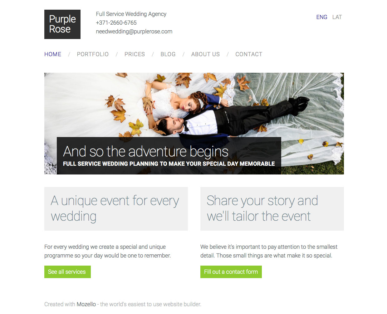
For example, in this image the white copy is easy to read on the background image. It would still look ok even if we cut the sides of the image.

Summary
If we were to draw one conclusion from all of the above, it would be the following - the more simple the design and the softer the colors, the easier it is for the user to perceive information.
The next article will focus on how to attract visitors to your website.