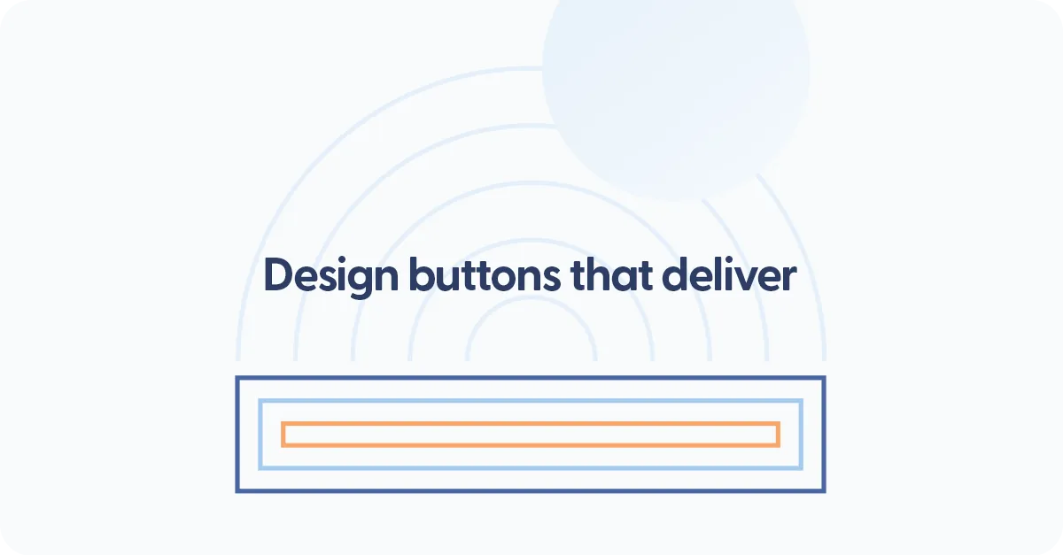
How to create call-to-actions (CTAs) that actually work
If you've ever visited a website, read a bit, scrolled around, and then closed the tab because you weren't sure what to do next… you've experienced a missing or weak CTA.
A call-to-action is the friendly nudge that guides your visitor to take the next step - whether that is buying, booking, subscribing, contacting, or simply learning more.
At Mozello, we see this pattern all the time:
Small business owners put so much energy into building a website, but forget the most important piece - telling visitors what to do with the information they just read.
A CTA is not pushy.
A CTA is not "salesy."
A CTA is simply good guidance.
And when used well, it can transform your website from a static brochure into a living, helpful tool that brings you customers and leads.
This article will teach you everything you need to know to create clear, effective CTAs, even if you've never built a website before.
Why CTAs matter more than most beginners think
Let's start with the simplest explanation:
Visitors never take action unless you tell them what action to take.
People don't naturally know what comes next.
They skim, they scroll, they get distracted - and with no clear direction, they leave.
Here are the most common scenarios where visitors feel "stuck:"
- They like your product but don't know how to buy it.
- They like your service but don't know how to book it.
- They want to contact you but aren't sure where the button is.
- They want to learn more but don't see an obvious link.
- They're interested but don't know if there's a special offer, free trial, or consultation.
This is why every single page on your website needs at least one clear CTA - and often several, depending on the content.
Think of your website like a guided tour. You're the guide. CTAs are the signposts that point people in the right direction.
What makes a CTA effective?
A CTA works when three things are true:
1. It is clear
Visitors understand immediately what pressing the button will do.
2. It is specific
It tells them the exact action - not something vague.
3. It is relevant to the moment
The CTA matches the content they just read.
Let's simplify with examples:
Vague CTA:
"Click Here"
Click here for what? Why? What happens?
Generic CTA:
"Learn More" (repeated everywhere)
Learn more about what? Why should they click?
Clear CTA:
"Book a Free Consultation"
The visitor knows exactly what they are getting.
Specific CTA:
"Get Your Personalized Quote"
The action is obvious and meaningful.
Relevant CTA:
After a section explaining your handmade candles:
"Shop Our Candle Collection"
This makes sense because it reflects what the visitor was just reading. You never want a visitor to pause and think. They should know exactly what to do - immediately.
The types of CTAs every website needs
Different CTAs serve different purposes. A healthy website uses a mix of them, depending on the goals of each page.
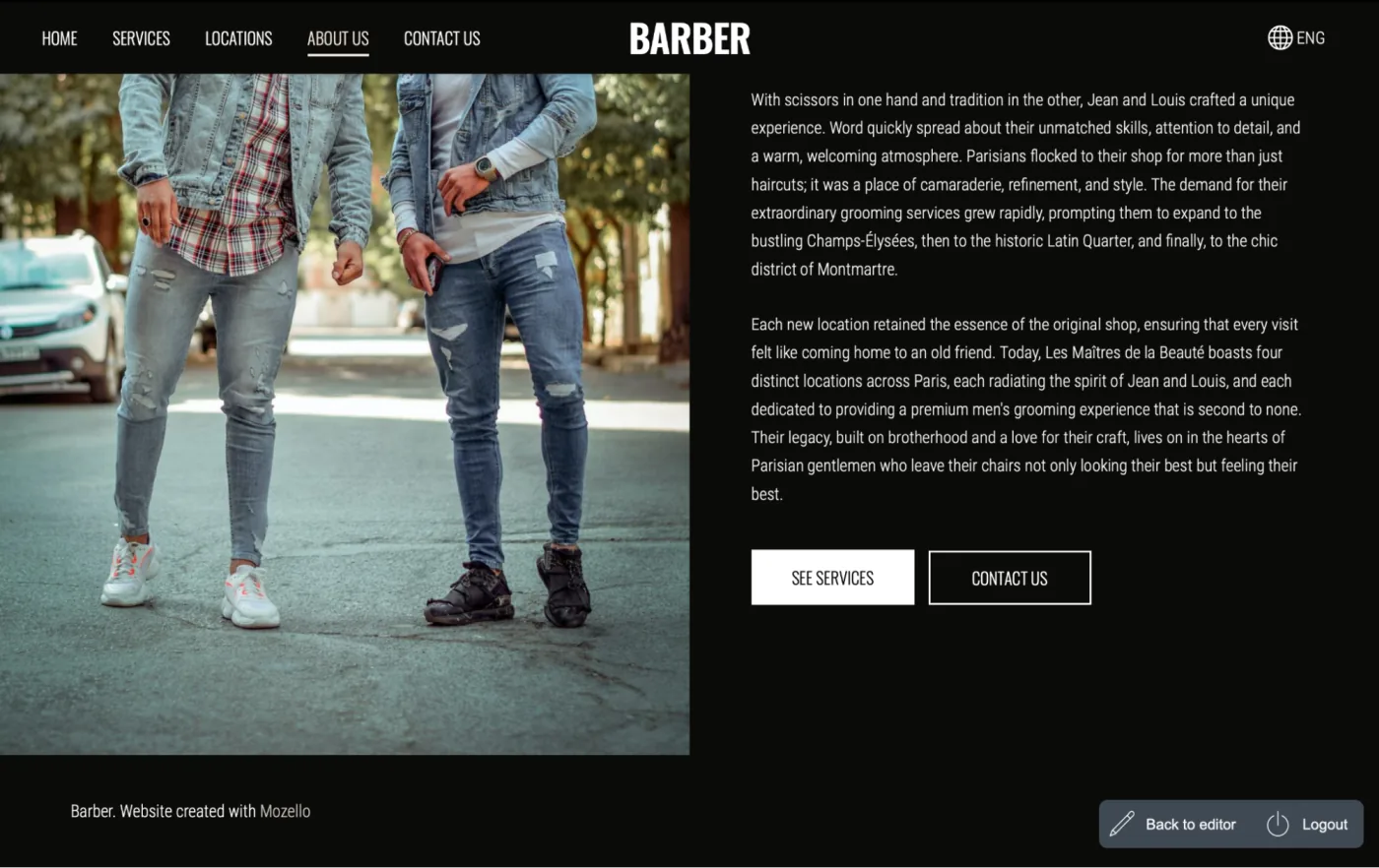
1. Primary CTAs (The main action)
These appear in the most visible places.
They represent the single most important action you want visitors to take.
Examples:
- "Buy Now"
- "Book an Appointment"
- "Start Free Trial"
- "Get a Quote"
- "Shop Our Products"
These should appear:
- in the hero section
- at the top of key pages
- in menus or floating buttons
- at the end of long pages
2. Secondary CTAs (For people who need more info)
Not every visitor is ready to buy immediately.
Some need more information, trust, or reassurance before committing.
Examples:
- "How It Works"
- "See Pricing"
- "View the Portfolio"
- "Read Reviews"
Secondary CTAs gently warm up visitors and move them closer to the main action.
3. Micro CTAs (Small clickable encouragements)
These are tiny nudges throughout your pages.
Examples:
- "See more examples"
- "View detail"
- "Read story"
- "Try the demo"
These keep the visitor engaged, curious, and moving forward.
A good website has a healthy, natural balance of all three types.
Where CTAs should be placed (And why placement matters so much)
The placement of your CTA is one of the most important parts of making it effective.
Even a perfect CTA won't work if visitors can't find it.
Here are the best locations to place your CTAs:
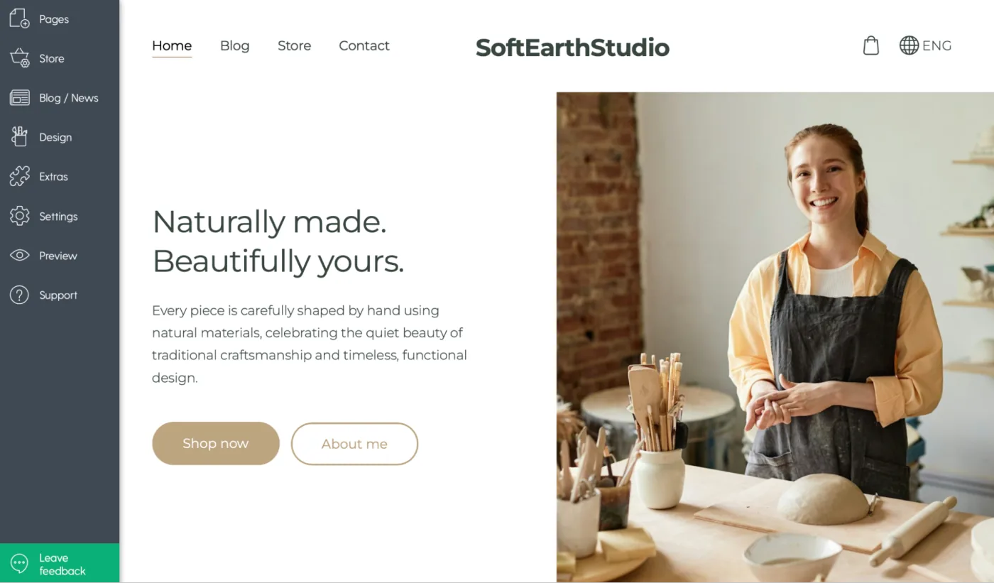
1. At the top of the homepage
This is where your most important action belongs.
Example:
Hero section with a big button:
"Shop now"
"About me"
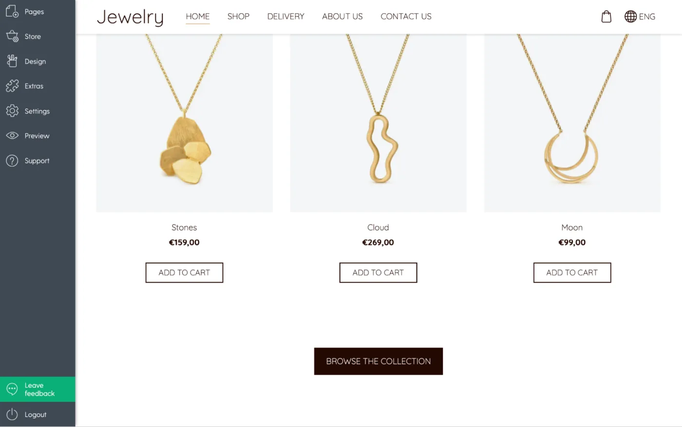
2. After a section that explains a benefit
Visitors need to understand your offer before taking action.
Example:
After describing your handmade jewelry:
"Browse the Collection"
3. At the end of every page
When people finish reading, they want to know what's next.
4. Inside long product or service descriptions
This helps people act without scrolling all the way back up.
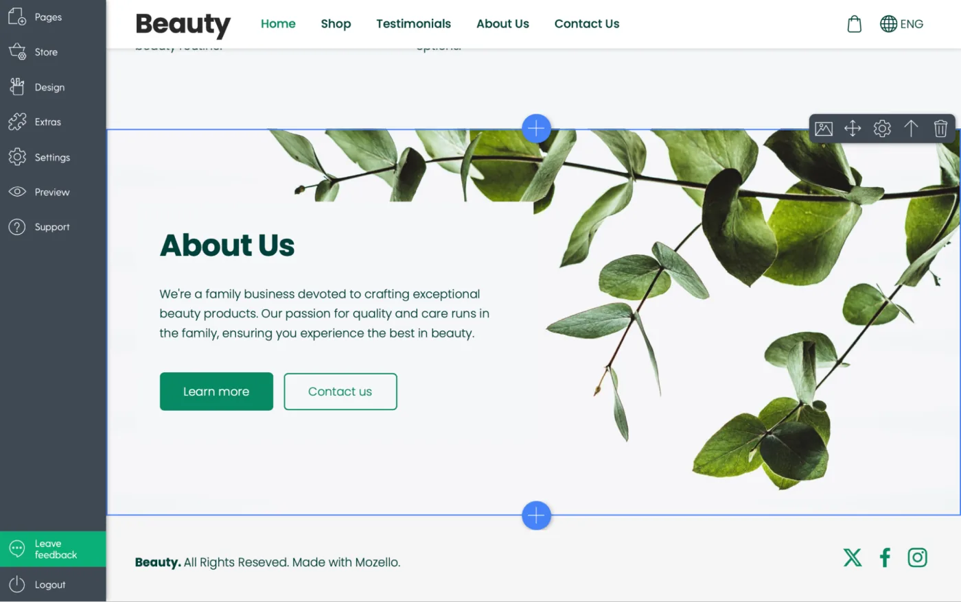
Mozello's simple block-based editor makes it easy to insert CTAs anywhere - hero sections, image blocks, text blocks, footers, and more. You don't need any technical skills.
Common CTA mistakes beginners make (And how to fix them)
After watching thousands of users create a website or build a website for the first time, we've noticed the same mistakes repeating.
Let's go through them one by one.
Mistake #1: Too Many Different CTAs
When every button says something different, visitors get confused and freeze.
Example of chaos:
- "Buy Now!"
- "Learn More"
- "Subscribe"
- "Book Today"
- "Try Free"
- "Explore"
- "Discover"
- "Find Out More"
Visitors don't know which matters most.
Fix: Choose one primary CTA and stick with it.
Your secondary CTAs should still support the same goal.
Mistake #2: Buttons that blend into the design
If your CTA looks like decoration, it will be ignored.
Fix: Make the button a contrasting, visible color
Not ugly - just clearly clickable.
Mistake #3: Boring or generic wording
Beginners often use safe words like:
- "Submit"
- "Send"
- "More"
These are not compelling.
Fix: Use meaningful action words
"Get Started," "Download the Guide," or "Book Your Session" all create clarity and motivation.
Mistake #4: Asking for too much too soon
For example:
"Buy Now" on a homepage where visitors don't yet trust you.
Fix: Warm them up with a smaller step
Example:
"Browse Products"
"See Pricing"
"View Examples"
Mistake #5: Not enough CTAs
Some beginners design beautiful pages... and end them without any guidance.
Fix: Add a CTA to every meaningful section of your website
Your visitors should always have a next step.
Before & after CTA examples (Realistic for small businesses)
These examples show how simple changes can dramatically improve your CTA clarity.
Example 1: Service business
Before:
"Contact us if you want more information."
After:
"Book Your Free Consultation"
(A direct invitation to the next step.)
Example 2: Online shop
Before:
"Browse"
Browse what?
After:
"Shop Our Winter Collection"
Clear. Specific. Relevant.
Example 3: Local professional (Hairdresser, Coach, Trainer)
Before:
"Send Message"
After:
"Book Your Appointment"
or
"Check Available Times"
Example 4: Bakery or handmade business
Before:
"Click Here"
After:
"See Today's Fresh Bakes"
or
"Order Custom Cake"
Simple clarity = higher conversions. Every time.
Designing CTAs that match your brand
Your CTA must not only be clear - it must also fit your brand personality. Think of your CTA as the "voice" of your brand speaking directly to the visitor.
If your brand is friendly:
"Let's Get Started!"
"Take a Look!"
"Start Your Journey"
If your brand is minimal and calm:
"Book Now"
"Get Started"
"Learn More"
If your brand is bold and energetic:
"Join the Movement"
"Start Today"
"Go For It"
If your brand is premium:
"Request a Consultation"
"View the Collection"
"Reserve Yours"
A CTA is one of the most visible parts of your brand, so its style should feel consistent - in tone, color, and presentation.
How Mozello helps you create perfect CTAs (Even with zero design experience)
You don't need design or coding skill to create excellent CTAs with Mozello.
Mozello gives you:
Ready-made button styles
Choose from clean, modern button styles that already look professional.
Automatic responsive design
Your CTA looks great on mobile automatically.
Easy color customization
Pick a contrasting color that fits your branding without worrying about technical details.
Flexible layout blocks
Add CTAs everywhere - inside hero sections, image blocks, text blocks and more.
Mozello's goal is to help small businesses build a website that not only looks good but works well - and CTAs are a huge part of that.
Final thoughts: CTAs are the bridge between interest and action
You can write beautiful text. You can upload great photos. You can build a website that looks polished and professional.
But without clear CTAs, your visitors have no direction. No next step. No path to becoming your customer.
CTAs are the bridge between curiosity and conversion.
And the good news is that anyone can create effective CTAs - even complete beginners building a website for the first time. With Mozello's simple, intuitive website builder for small business owners, adding clear, attractive CTAs is easy and fast.
Give your visitors the guidance they need.
Show them the way.
Make the next step obvious.
Your business - and your customers - will thank you.