9 small things to do on your website that yield big results [free printable checklist included]
![9 small things to do on your website that yield big results [free printable checklist included]](https://dss4hwpyv4qfp.cloudfront.net/blogengine/en/content/2_posts/20180704_easy-cro-improvements-for-websites/how-to-optimize-a-website-and-boost-conversion-rates-1.jpg)
Have you ever wished your website performed better? Would you like to get more purchases, leads, blog subscribers? Then you're in the right place.
You may not be able to design the perfect website, but you can perfect the few things that visitors pay attention to. Today I'm going to share 9 improvements that you can do on your website (in 30 minutes or less!) that are guaranteed to yield big results.
The best part?
At the end of this article, you'll find a free checklist that includes all the tactics mentioned in this post - download it, print it, and keep it at hand. The printable checklist includes some bonus tips and tactics!
Here are 9 simple things you can do to optimize your website and boost your conversion rates in no time:
1: Write an effective headline
The headline is extremely important for two reasons: it's the first thing visitors see when they land on your website, and it tells search engines what the particular page is about. For these reasons, make sure you pay extra attention to it.
Here's what a good headline looks like:
- It's clear and straight to the point. By reading just your headline, people should understand right away what your website is about and why it's relevant to them. In other words, don't try to be too artistic and clever - just say what it is or what it does, and whom it's made for.
- It has a keyword in it. As Google relies on your headline to make sense of what your website is about, make sure you include a business-relevant keyword in it.
- It's understandable. When writing your headline, skip business jargon and vague buzzwords, such as innovative, game-changer, etc. Because no one really knows what these words mean.
2: Highlight solutions, not features
Remember that people don't care about your features or what they do. People care about their problems and challenges they're facing at the moment. Therefore, when writing your website copy, turn your features into solutions.
For example:
If your service sends reminder notifications, say that it helps users stay organized and never forget things. Or if your product is small, say that it saves space. Don't make people think - highlight solutions, so that they know right away if and how your product or service can help them.
Pro tip:
Be specific and back up what you're saying. For example, don't just write that your product is high quality, as that word means nothing today. Instead, say that you give a 3-year warranty on your products, or that it's made in the EU, which has become a seal of quality for many online shoppers.
3: Use clear calls-to-action
Call-to-action buttons guide users through your website, from one step to the next, until they become your paying customers. Your goal is to make sure people know what the next step is, and encourage them to take it.
That being said, a good call-to-action:
- Continues the sentence ''I want to... '' For example, people want to ''subscribe'' to your email list, not ''submit'' something.
- Is not too long. While you can experiment with the length of your button copy, just keep in mind that 52.2% of all website traffic is generated through mobile phones. A long-copy call-to-action button that looks good on desktop may look bulky and unreadable on mobile devices.
- Is visible. There's no surprise that red hues are the most popular for website buttons - these colors stand out. For users to notice and click on your buttons, they need to be prominent. Therefore, leave the transparent ''ghost buttons'' alone, and go with the good ol' solid button in a color that stands out in your website design.
4: Add a popup to grow your email list
Did you know that email is still one of the best-performing sales channels? Well, now you do. By subscribing to your list, these people have expressed their interest in your product or service, and are therefore more likely to become your paying customers.
Email marketing doesn't work if you don't have a list of subscribers, so as soon as you launch your website, make sure you start growing your list. The easiest and cheapest way to do it, is to add a popup that shows up when the visitor is about to leave your website. It's the best time to collect emails in a non-intrusive way - they're already done with browsing, and the other option is to lose that lead forever.
There are many tools for adding a popup to your website. For example, Engaga is a great tool for designing beautiful popups and slide-ins.
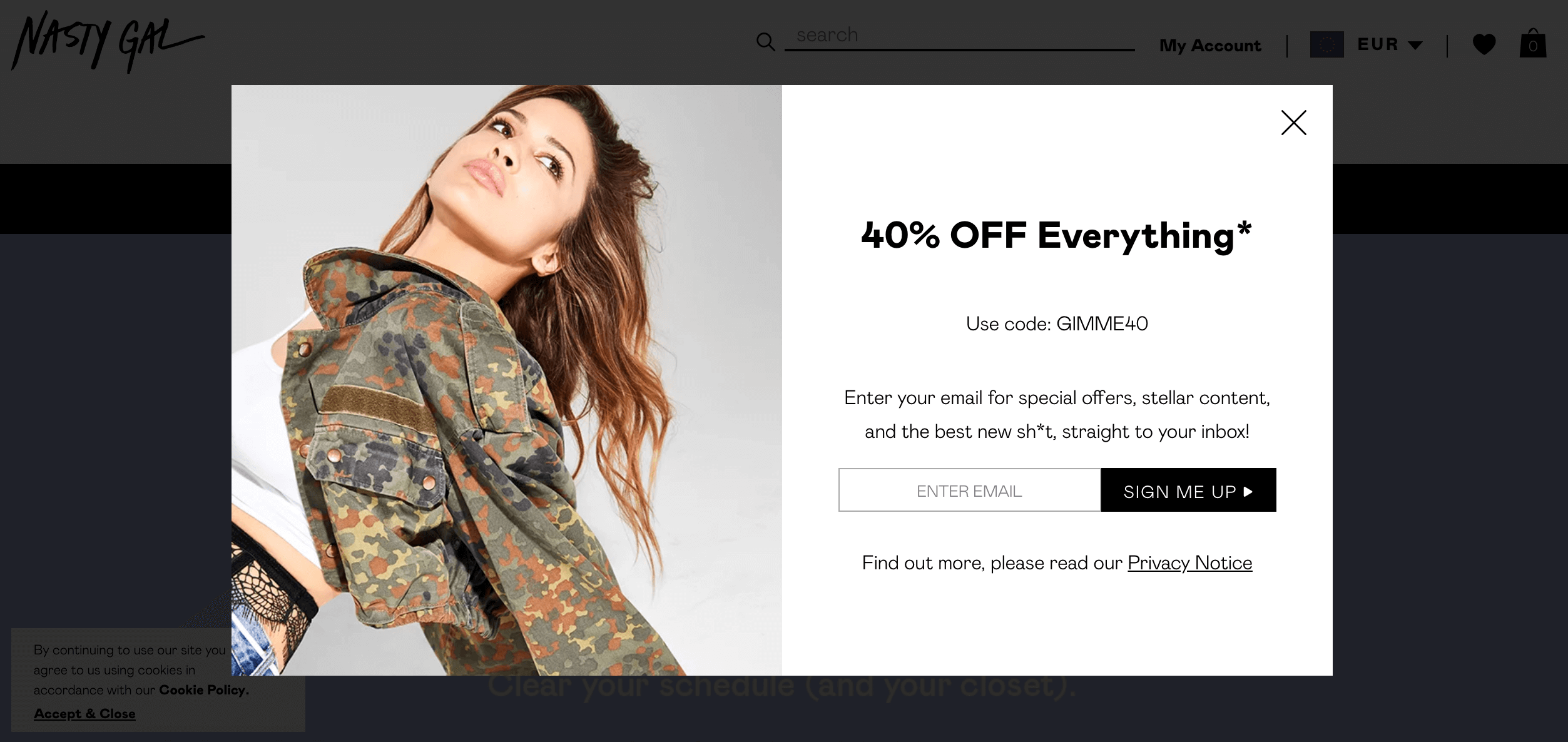
Pro tip:
To ensure seamless user experience, search engines don’t like popups to be shown on mobile, as they're more difficult to close on small screens. Google can penalize websites that ignore this, so make sure to limit your popups to “desktop only”. To be 100% safe, choose a system that makes popups mobile-friendly automatically, such as Engaga.
5: Invest in high-quality visuals
When someone lands on your website, you've got just 2.6 seconds to make a good first impression. Needless to say, design and quality of the visuals matter to nail that impression.
Blurry images and cheesy stock photos don't make you look very professional and trustworthy. So, if possible, invest some money in a photoshoot with a professional photographer. If that's not an option, at least keep away from overused and impersonal stock photos, and find something more original on photo libraries like Unsplash, Barnimages or Pixabay.

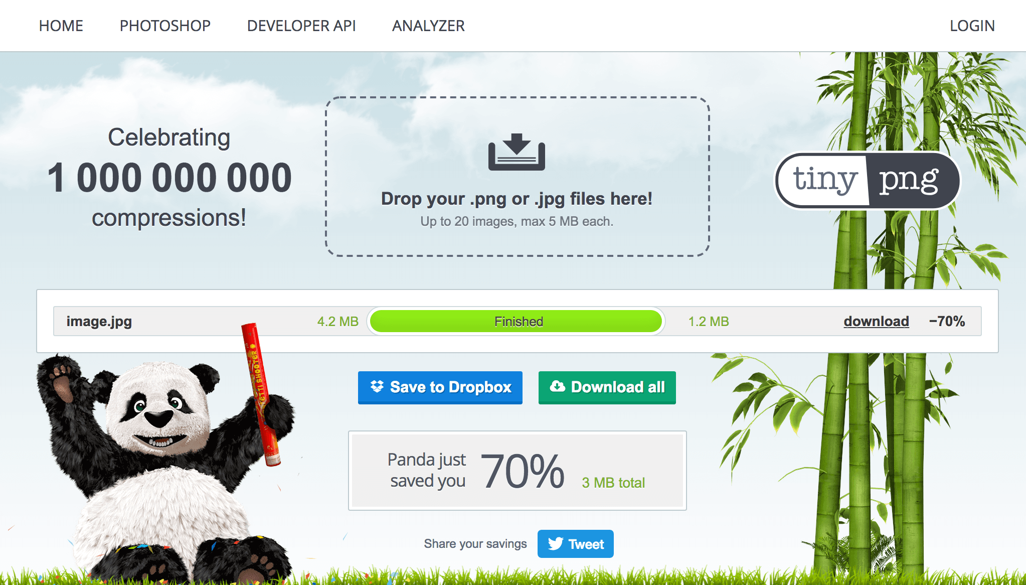
6: Optimize your image size
Another way to leave a good impression about your brand is to make your website load quickly. The truth is people hate to wait, and they abandon slow websites without looking back. In fact, 40% of users won't wait more than 3 seconds for a page to load, and 46% never revisit poorly performing websites again.
One of the most common things that slow down websites are non-optimized images that are heavy and take time to load. So, whenever you upload an image, do these three things:
- Resize it. That is, don't upload a 5000x5000px image in a 1200x1200px spot.
- Compress it. Use tools like TinyPng to compress your images and save megabytes without compromising the quality of your visuals.
- Use JPEG instead of PNG for photos. PNG photos are usually heavier and thus take more time to load.
Pro tip:
If your website is built on Mozello, you can lay back and don't worry about resizing your images - Mozello does it automatically for you.
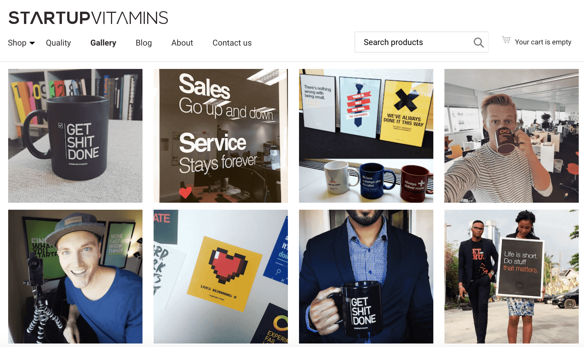
7: Make use of your customer photos
Studies show that adding photos of customers using your product can help you boost your conversion rates by almost 29%. It's because customer photos look more authentic and real when compared to branded visuals.
If you sell products online, add customer photos to your product page or create a specific page for these images. Show your potential buyers that there are people who already have bought and are enjoying your product - it'll make your brand look more trustworthy.
8. Add testimonials
If your product or service is not very photogenic, instead of customer photos use testimonials - short quotes from your customers who approve and recommend your product to others.
Because testimonials come from other customers, they appear more credible than any brand-generated content. In fact, stats show that 84% of people trust online reviews written by other consumers as much as they trust recommendations from friends. Just imagine the possible impact on your conversion rates!
That being said, the most powerful testimonials are those that include a photo and name of your customer. So, whenever customers leave a good feedback, ask them if you can use it on your website. When they've agreed, ask for their name and a headshot.
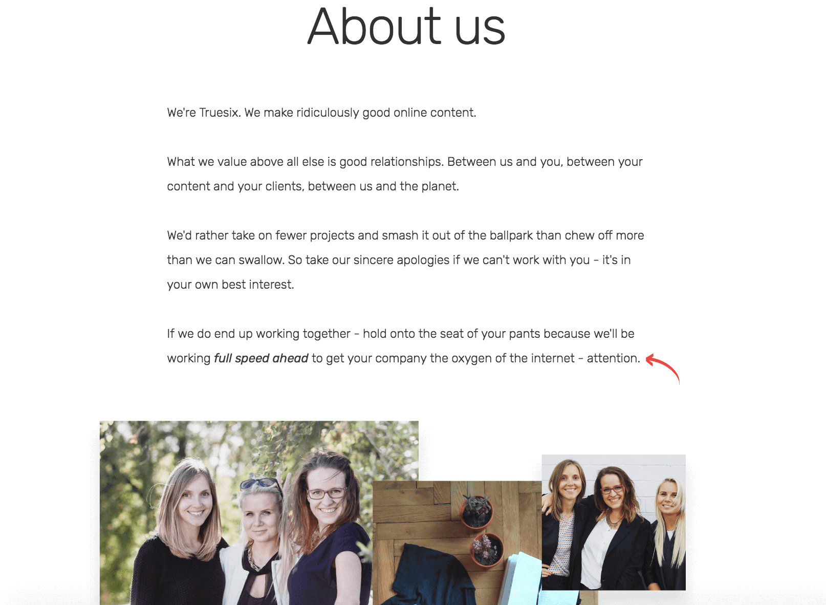
9: Pay attention to your About us page
Many business owners don't pay much attention to their About us pages, and that might be a costly mistake. For many websites that's one of the top visited pages because users want to get to know the people behind the company before they do business with it.
Show your About us page the care and attention it deserves - use it to introduce yourself, tell your story, and show that there are real people behind the company name. Bear in mind that this is not the place to be salesy and talk about your products and services. Instead, show the human side of your business.
Pro tip:
Many users visit the About us page to find the contact information, like your address, email address, phone number, social media profiles, etc. So, make sure it's there and up to date.
FREE bonus: download our free checklist that will help you execute the 9 techniques from this post. (It includes several additional tips as well!)