
How to create a website: A beginner-friendly guide to formatting and design

Introduction: Why Learning How to Create a Website Matters
If you’re thinking about building an online presence—whether it’s for your small business, side project, or personal brand—you’ve probably asked yourself how to create a website that actually works.
Your website is your digital storefront. It’s the first place potential customers or readers will visit, and it’s where they’ll decide in a matter of seconds whether to trust you, stay, and explore—or leave and never come back.
The good news? Creating your own website has never been easier. With Mozello, a simple yet powerful website creator, you don’t need coding skills or a design degree. But here’s the thing: even the best website builder for small business can’t save you from one common mistake—poor formatting.
Content formatting plays a huge role in how visitors experience your site. If your text is hard to read, your design feels overwhelming, or your layout looks messy, people will click away. But when you get formatting right, your website becomes inviting, professional, and easy to navigate.
In this guide, we’ll walk you through practical formatting tips to help you make a website that stands out—plus we’ll share bonus advice for designing a site that’s not just pretty, but also effective.
Website Content Formatting: Why It’s So Important
Think of your website like a shop window. You might have the best products or services inside, but if your display looks cluttered, no one will stop to look. Formatting ensures your visitors can read, scan, and understand your content quickly—without frustration.
Proper formatting makes your site:
- Readable: Visitors can skim and still get the key points.
- Professional: A clean layout builds trust.
- User-friendly: People find what they’re looking for without effort.
- Accessible: Content works across different devices and screen sizes.
With Mozello, you already get sleek templates designed with readability in mind. But knowing the formatting basics will help you take your site from “good enough” to “wow, that’s impressive.”
Practical Guidelines for Formatting Your Website
Here are essential rules every beginner should follow when learning how to create a website that looks polished and professional.
1. Use Strong Contrast Between Text and Background
Readable text is non-negotiable. Stick with dark text on a light background (like black on white or dark gray on light gray). If you love dark themes, white text on a black background can work—but only in moderation.
Mozello tip: Always preview your site on multiple devices before publishing. What looks stylish on your desktop may be impossible to read on a phone.
2. Stick to Calm Color Tones for Body Text
Reserve bright colors for buttons, links, or headings—not for paragraphs. Your visitors should never feel like they need sunglasses just to read your content.
Best practice: Use a calm, neutral color for body text and save vibrant colors for calls to action (e.g., your “Buy Now” or “Contact Us” buttons).
3. Use Bold and Italic Text Sparingly
Bold and italics should be used like seasoning in a dish—a little enhances flavor, too much ruins it.
- Use bold for keywords, key ideas, or CTAs.
- Use italics for book titles, quotes, or emphasis.
‼️ Avoid entire paragraphs in bold or italics. It slows down reading and feels overwhelming.
4. Break Up Large Chunks of Text
Most people skim rather than read every word. Help them by using:
- Short paragraphs (2–4 sentences)
- Headings and subheadings
- Bullet lists and numbered lists
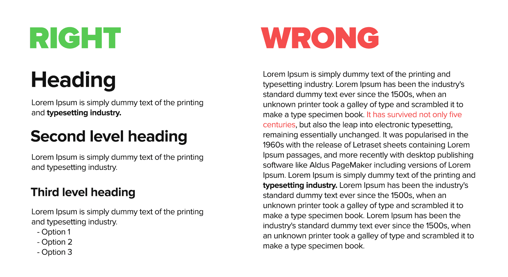
This way, visitors can quickly find the section they’re most interested in.
5. Make Headings Descriptive, Not Just Decorative
Headings aren’t just about style—they guide readers through your content. Instead of writing “Tips” as a heading, write “Tips for Formatting Your Website Like a Pro.”
SEO bonus: Search engines also use headings to understand your content, so including keywords like create a website or best website builder naturally in headings can help you rank better.
6. Keep Line Spacing Comfortable
Crammed text is hard to read. Add enough line spacing (also called “line height”) so that each sentence has breathing room. A good rule of thumb: 1.4–1.6 times your font size.
Mozello tip: Choose clean fonts like Arial, Open Sans, or Roboto. They’re easy to read across all devices.
7. Align Text for Easy Reading
Left-aligned text is the easiest to read, especially in longer paragraphs. Avoid centering big chunks of text—it looks messy and strains the eyes. Save center alignment for titles, quotes, or short call-to-action phrases.
8. Use White Space Wisely
White space (empty space around text, images, or sections) keeps your site clean and easy to navigate. Don’t feel like you need to fill every corner with content.
Think of white space as a way to let your most important content stand out.
9. Balance Text With Visuals
Walls of text are intimidating. Break them up with images, icons, or graphics that support your message. Just make sure images are compressed so they don’t slow down your site.
Mozello tip: Use visuals consistently. If you start with clean illustrations, don’t suddenly switch to stock photos that look out of place.
10. Use Lists for Clarity
Whenever possible, use bullet points or numbered lists to simplify complex information. They’re easier to scan and understand compared to long sentences.
For example, if you’re sharing features of a product, list them instead of hiding them in a paragraph.
Extra Tips for Making a Website That Works
Now that you’ve got the basics of content formatting, let’s take things a step further with some practical tips to make your website not just readable, but effective:
Choose the Right Website Builder
If you’re new, using a website builder Mozello is the fastest way to get started (think Wix alternative). In most of them you don’t need any coding skills. For entrepreneurs, a website builder for small business often includes features like booking systems, online stores, or other useful and powerful features.
Keep Mobile in Mind
More than half of internet traffic comes from mobile devices. Always check how your site looks on smartphones. Good formatting should adapt automatically with a responsive design.
Use Clear Calls-to-Action (CTAs)
Whether you want visitors to subscribe, contact you, or buy something, make it obvious. Use buttons that stand out, short CTA text, and place them where people naturally look (like after a paragraph or at the end of a section).
Don’t Forget SEO Basics
Sprinkle your keywords naturally into your text—like how to create a website, build a website, and make a website. But don’t force it. The flow should always feel natural and friendly.
Optimize Your Images
Large image files slow down your site. Compress them before uploading, and always add alt text for accessibility and SEO.
Test Before You Launch
Click every link, test forms, and read your text out loud. If something feels clunky or confusing, fix it before going live.
Conclusion: Start Making Your Website Today
Learning how to create a website doesn’t have to feel overwhelming. With the right approach, a reliable website creator, and some smart formatting choices, you can design a site that feels professional and welcoming—without needing years of design experience.
Remember, the goal is not just to build a website, but to make one that serves your audience. By keeping your content clear, your formatting consistent, and your design user-friendly, you’ll set yourself up for online success.
So go ahead—pick the best website builder, start experimenting, and most importantly, have fun making a website for a small business or personal project. Your website is your digital home—make it a place visitors want to come back to.