
Mozello update: Design - redesigned & improved
Last year Mozello saw a great deal of improvements within e-commerce functionality. While we are committed to continue working on e-commerce features, this year we shifted our attention to design.
That is why this year's theme is - design redesigned. We looked at almost many aspects of how Mozello lets you design your website or online store and tried to improve the features and experience.
So without further ado let's dive in and show you what is new.
Header options
This update brings multiple new additions and adjustment options to the main header available via header settings.
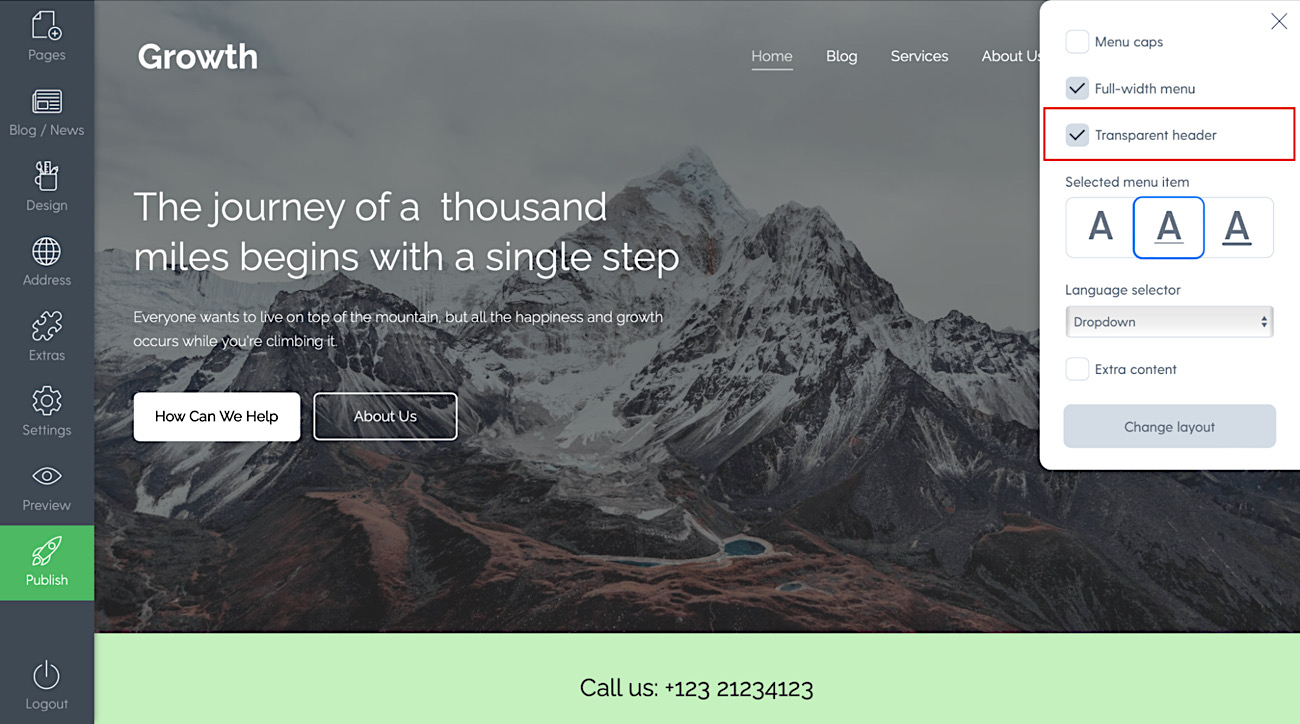
Transparent header option
There used to be a time when transparent header that looks great over an image was locked to specific designs - that is a thing of the past.
Now you can make your header transparent regardless of which design you have chosen. All you have to do is create a sitewide banner at the top of the page and in header options tick the checkbox - Transparent header.
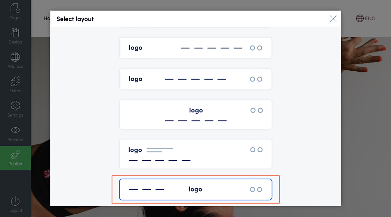
New menu layout with a centered logo
This was probably the one last menu style that was missing - so we added it. It brings the logo to the middle of the page and menu items on each of the sides. Here's how it looks and how you can enable it.
Click on the settings icon in the top right corner and then select option “Change layout”.
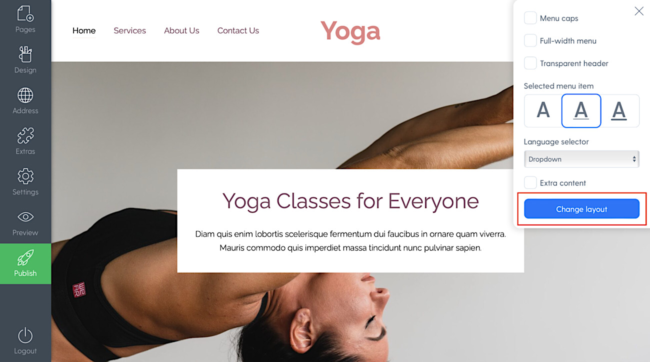
Design Tip: We suggest using this type of menu if you only have up to 4 pages in the main menu.
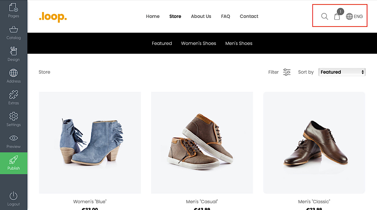
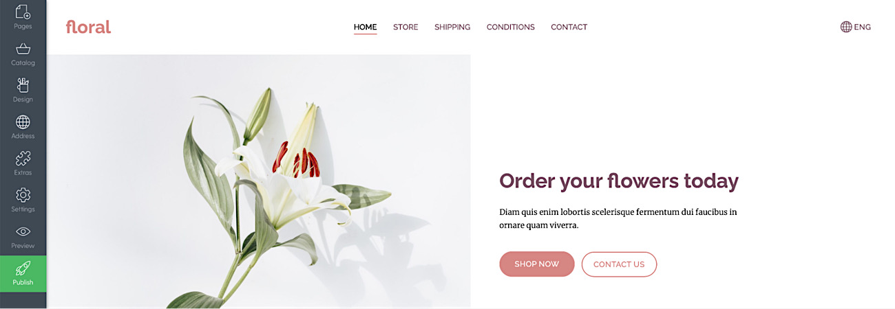
Shopping cart that is visible and accessible at all times
Now your store's shopping cart will show up in the traditional place - right side corner of the main menu and will be accessible and visible at all times, even when the visitors scroll the site.
Here's how it looks:
Other new header design options
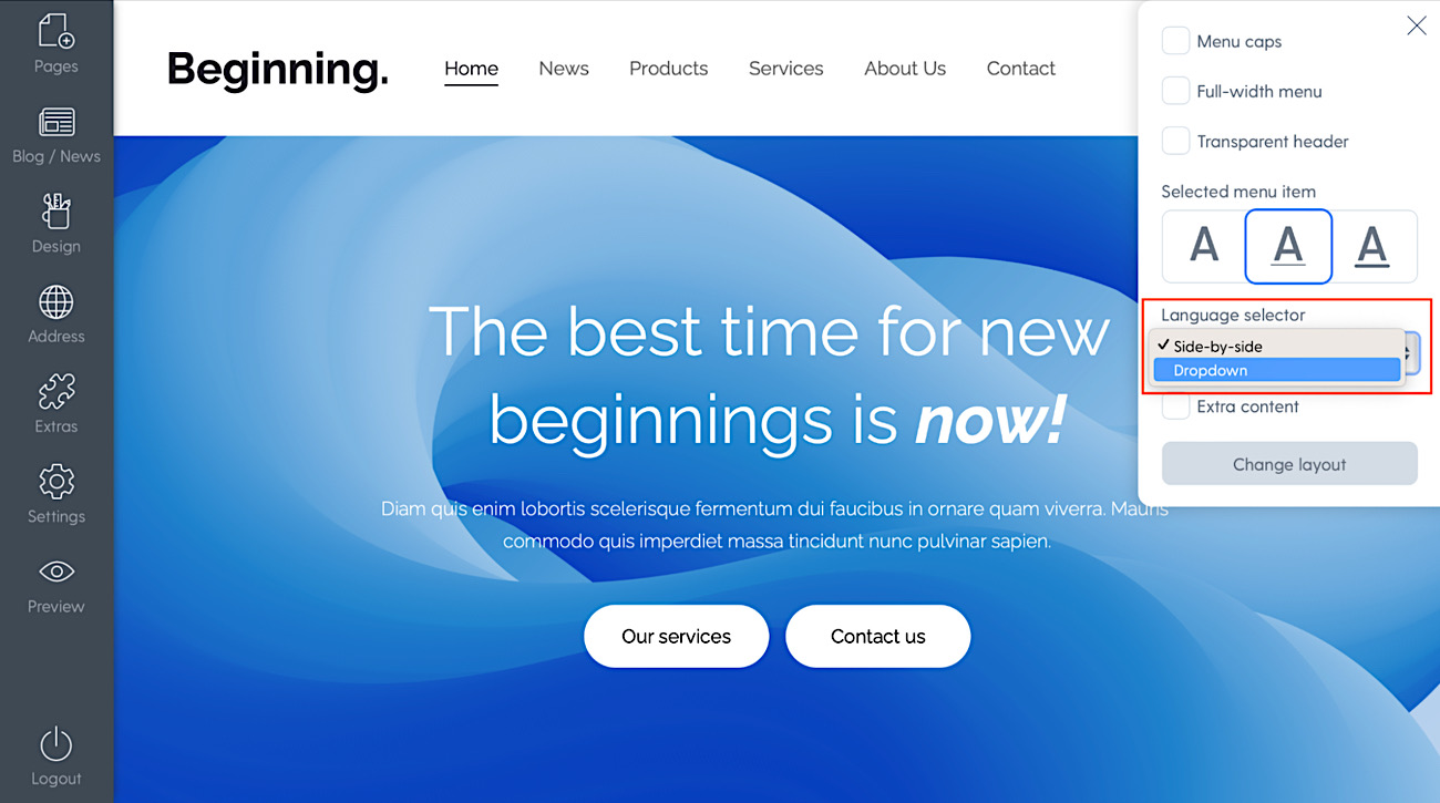
Dropdown language selector
If you have multiple languages in your site or store you can now select the language selector to show as a dropdown menu instead of next to each other.
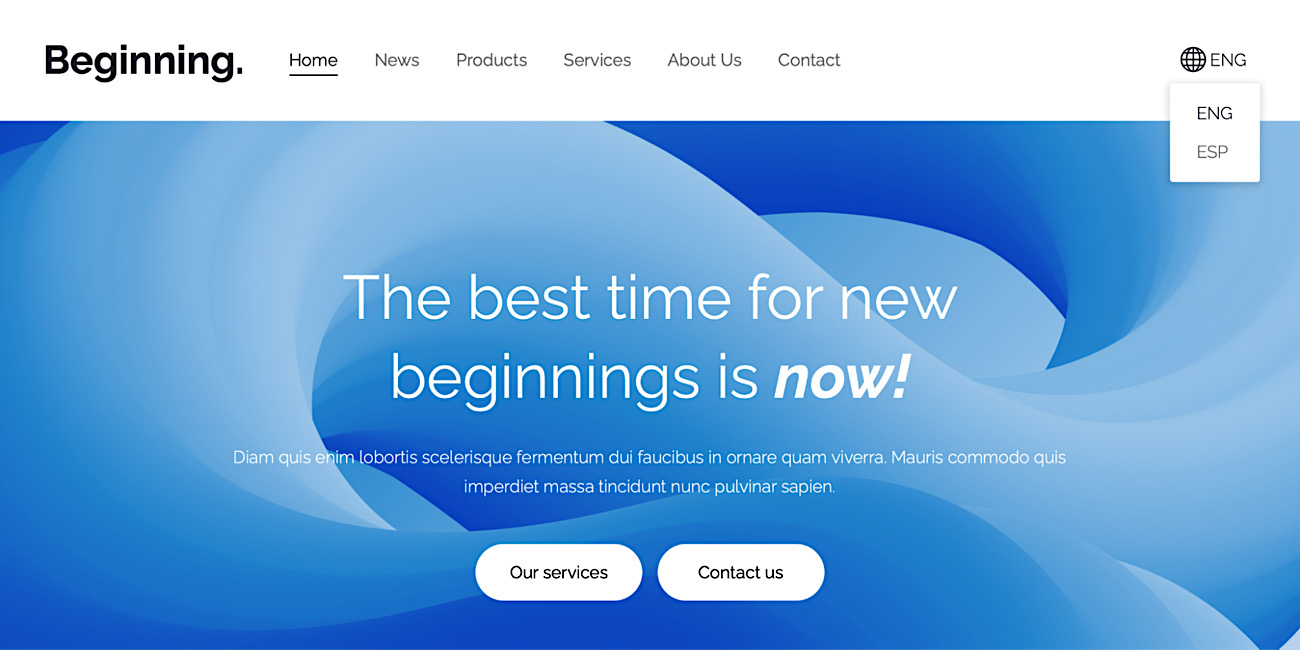
You can change it in header options at any time.
Full-width menu option
This feature lets you free your site's menu from constraints and make it adapt to the width of the screen. It's not like you have to do it but now you can if you like how it looks. This will mostly impact visitors with wider screens.
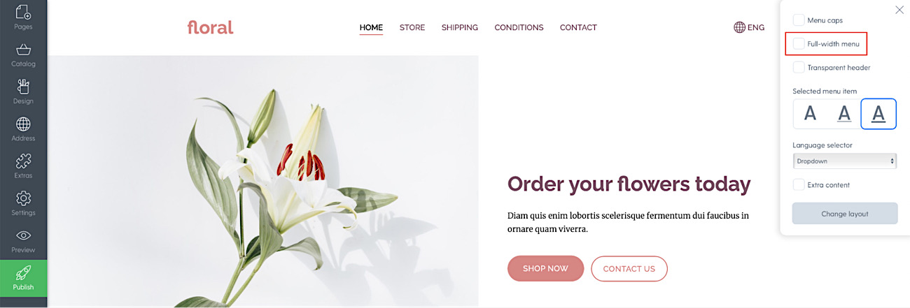
You can change it in header options at any time.
Menu letter style & item marker options
Another thing that was locked to specific designs in the past was your menu text style and how it looks when a page is selected. We changed that. Now you can choose yourself if your menu will be in uppercase or lowercase and how the selected menu item is shown (with a thick, thin underline or no underline).
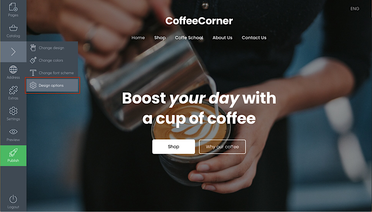
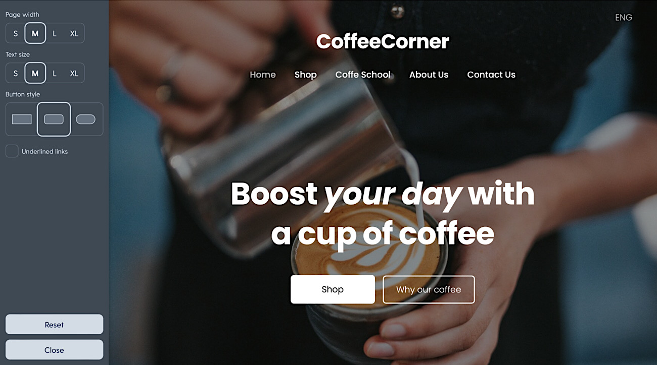
New sitewide design options
Have you ever wanted to adjust the width of your whole site or the overall text size. Now you can! Maybe you wanted to change the button style of your website from square to rounded. Now you can!
You can find all the adjustments here: Design -> Design options
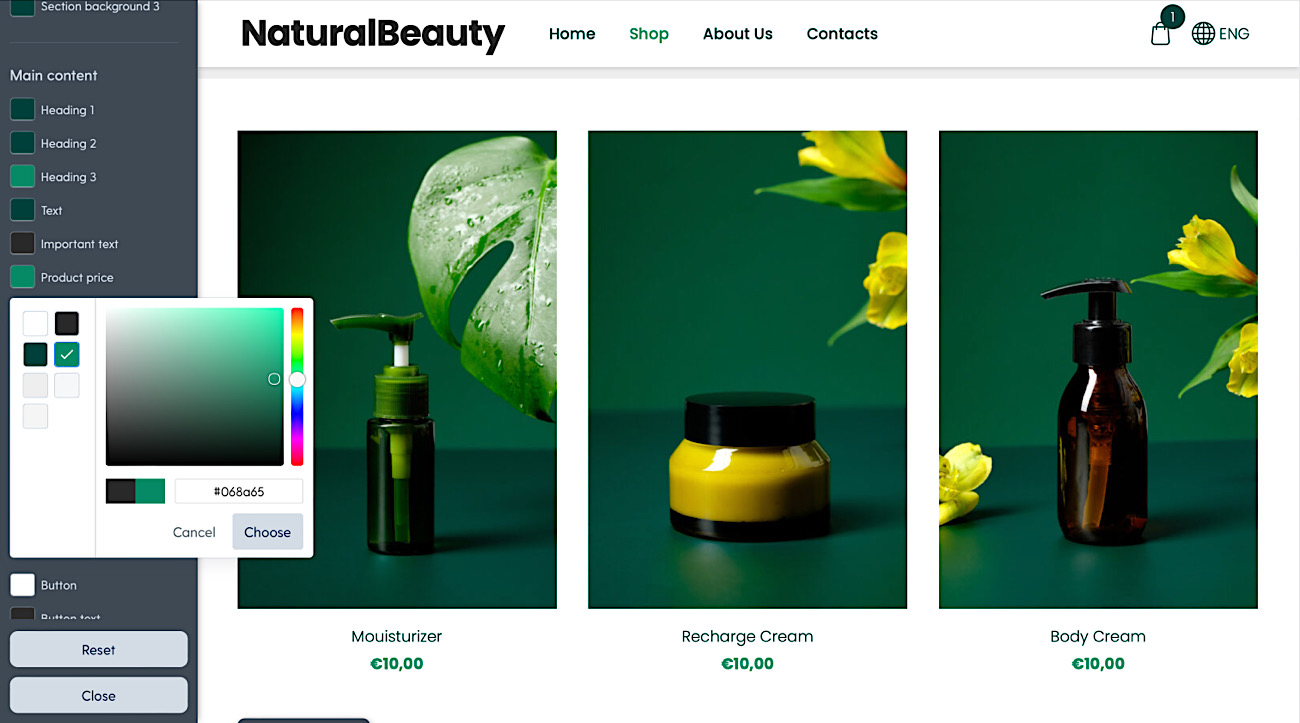
Updates to color options and reorganized color view for easier editing
Due to the new design system we have expanded and updated the color options.
Not only are there tons of new schemes but also all designs now support light or dark color schemes that you can switch any time. Before, color background designs were locked to only some templates. Now you can make any template look the way you want.
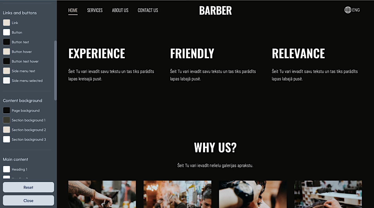
There are also new colors for secondary content. Now you can adjust secondary buttons on lighter or darker section backgrounds to your liking.
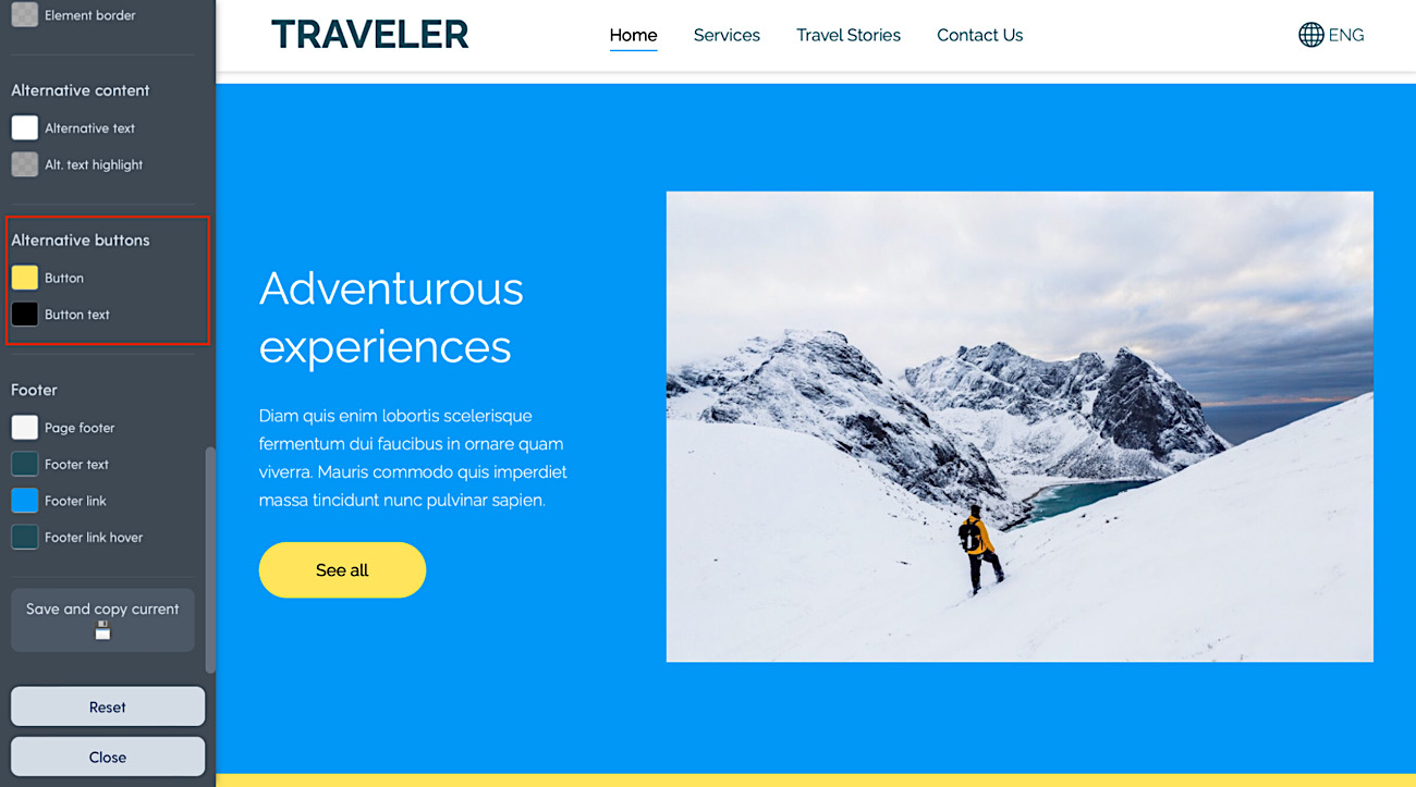
On top of that you can now adjust the shop category menu and product price color.
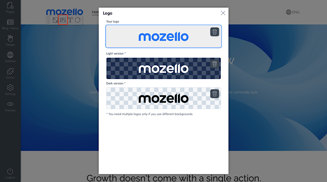
A completely new and improved way to insert your logo
In contrast to the old “free text” field, the new logo features a dedicated space and easier uploading and sizing of logo image.
You can have various logos for various backgrounds, to ensure contrast between logo and header background when using the new transparent header feature and having different header background in different pages.
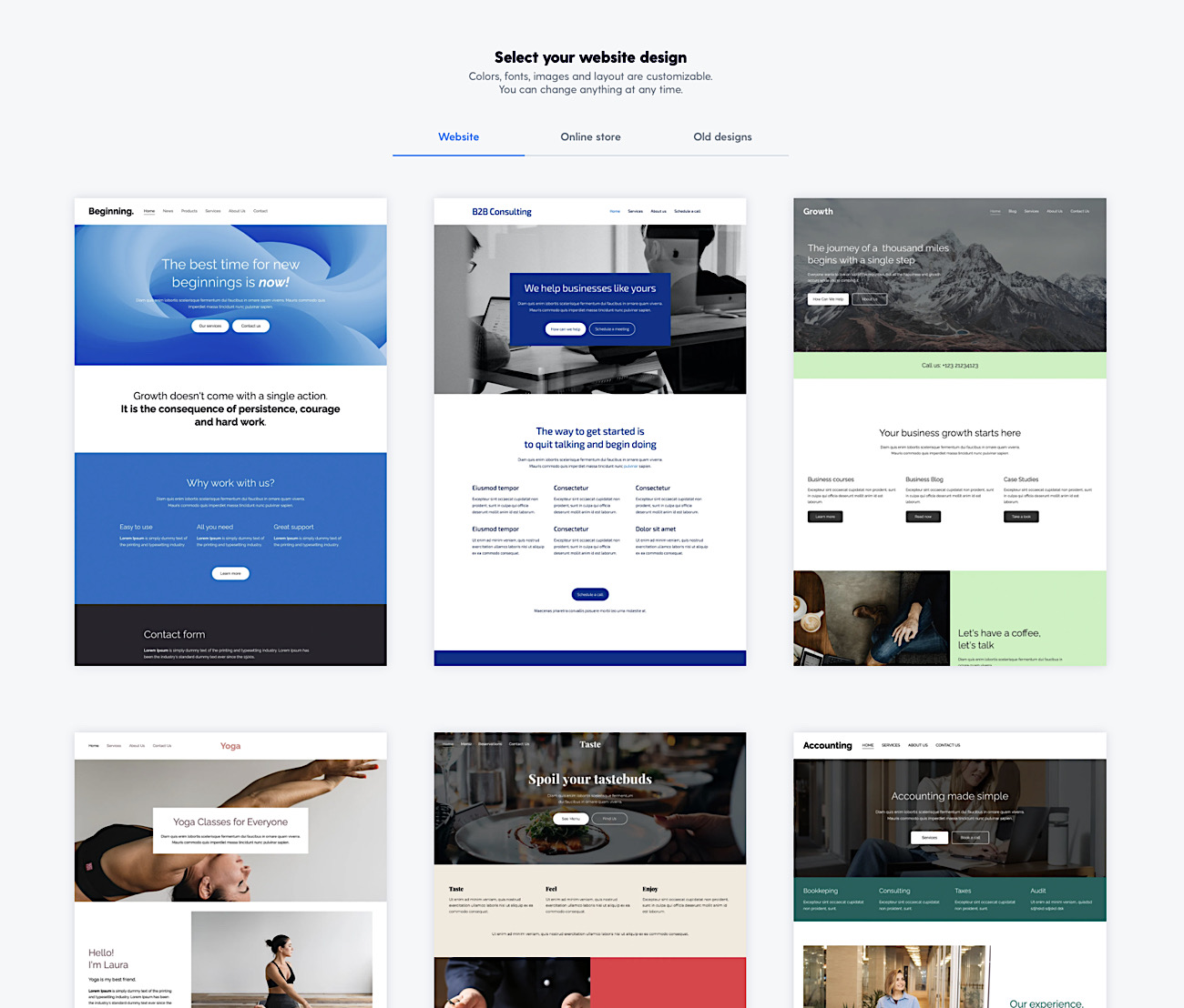
All new website & store templates
Some of the past design templates had some limitations to functionality and were looking outdated. We're glad to say that is the thing of the past now.
We have completely redesigned, unified and changed all the templates to a new flexible system. Not only the templates look more fresh but are more complete right out of the box and support every single feature that Mozello offers. No more getting stuck to design limitations.
I'm an existing user - what to do and how to access these features
To use all the new features, you must change your existing design to one of the new designs. But don't worry, you will not lose the entered information.
The one limitation is that the new designs do not support old-style “special” page banners. You must use the regular banner component instead to recreate the previous look.
Migration is safe. You will be able to switch back to your old design in case you do not like the new look.
Migration from old to new designs
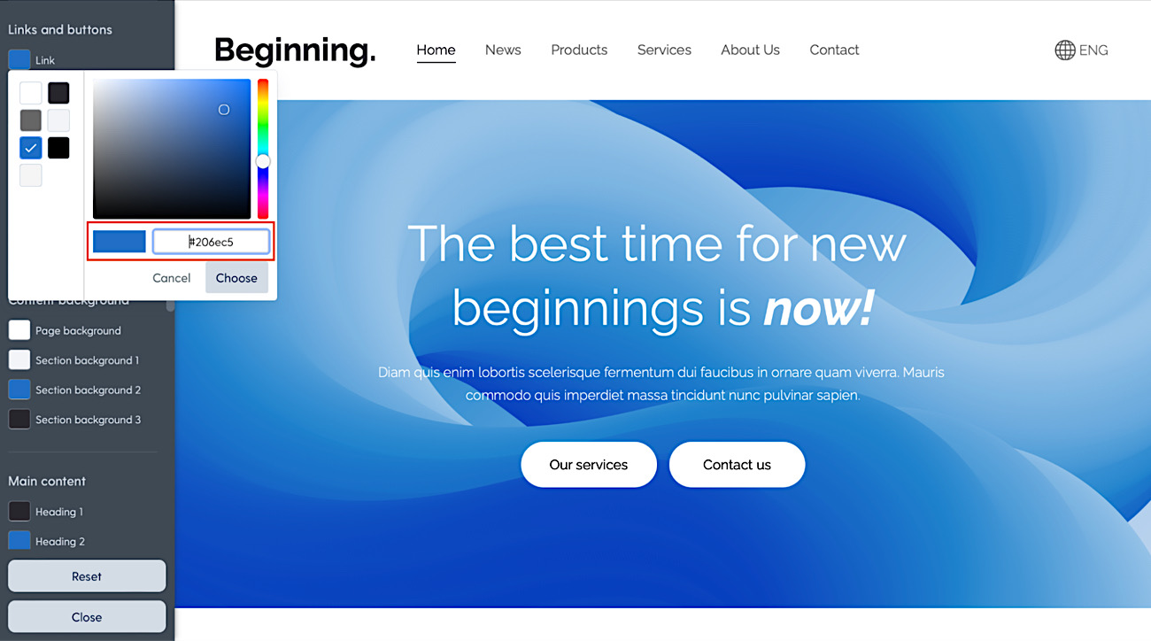
Step 1. Save your color codes
Go to Design -> Change Colors -> Advanced and save all color codes one by one in a text file so that you can use them later.
Step 2. Save any old style top banner texts
The old style banner will not be available in the new designs, because it has been replaced with a new one. This was a confusing feature for many customers and the new banner component is much more powerful.
That is why you should save the texts you have in the current banner for Step 5.
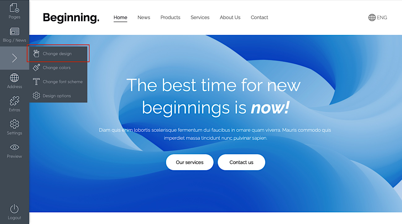
Step 3. Select any of the new designs
Go to Design -> Change Design. Note that all your content and images will be preserved (except for the old style top banner).
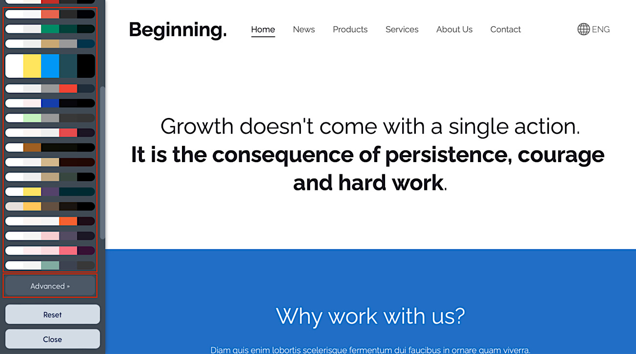
Step 4. Set the colors
Go to Design -> Change colors and use any of the schemes or click Advanced and paste your old color codes there.
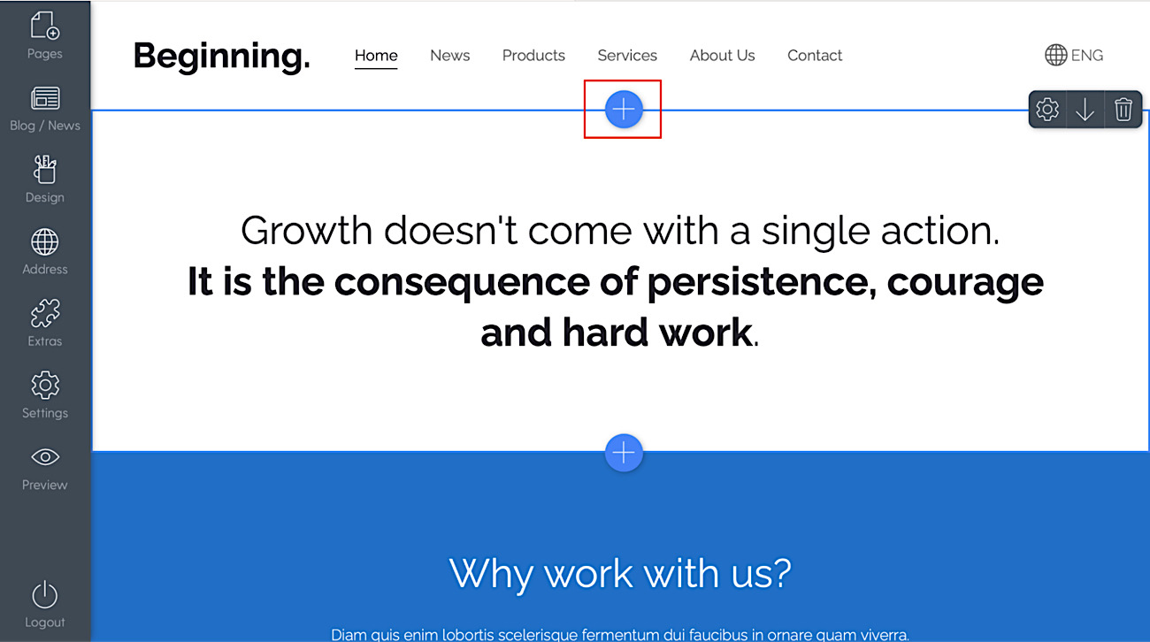
Step 5. Restore the banner, if it is no longer visible
If you were using the old style top banner, it will no longer show.
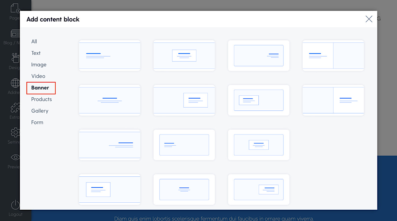
- Click on the “+” symbol near the top, then click “Banner” and choose any banner style (you can change this any time later, without losing entered content).
- Edit texts.
- Add banner image.
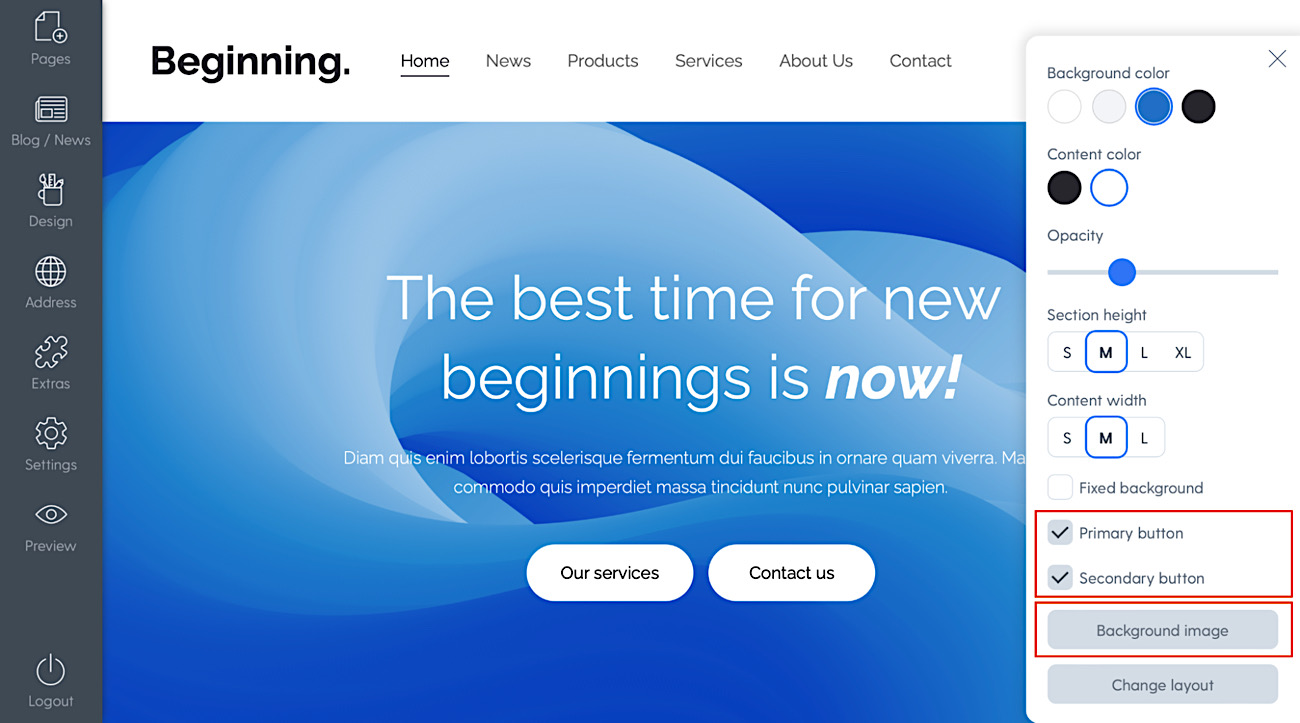
- Enable and customize buttons via banner section options.
Step 6. Go through all pages and see if all looks good
It is recommended to check everything. In case you need to go back to the old design, you can do so (but you must remember which design you were using).
Important notes
Color, font, header and footer customizations are attached to the design.
When you have custom colors, fonts, header or footer for one particular design, these customizations will stay connected to that design and when you switch to a new design and then later go back to the previous design, the color and font customizations will be there.
There is one exception to header options - Transparent header option is attached to the particular web page (and not the entire design or website).
What's next?!
As always we'll keep on working to make Mozello better for people like you. Few things that we are currently working on and can tease now is:
- new content block styles (pricing menu/table block & accordion block)
- SEO features that'll allow shop owners to edit meta tags for all categories separately
But of course there are more things in the pipeline - just we are not ready to talk about them yet. In general - the e-commerce feature set needs some additions, same goes for gallery and blog, we have everything in our backlog and will continue designing and releasing new features gradually.
To conclude, we would like to thank all our clients for trusting us and using Mozello.
If after reading this you remembered that you lack a particular feature, feel free to contact us, and offer your feedback. Every vote counts, and though the suggestions outpace our ability to implement them immediately, we try to prioritize the things that are most commonly asked for, so we look forward to your thoughts.