
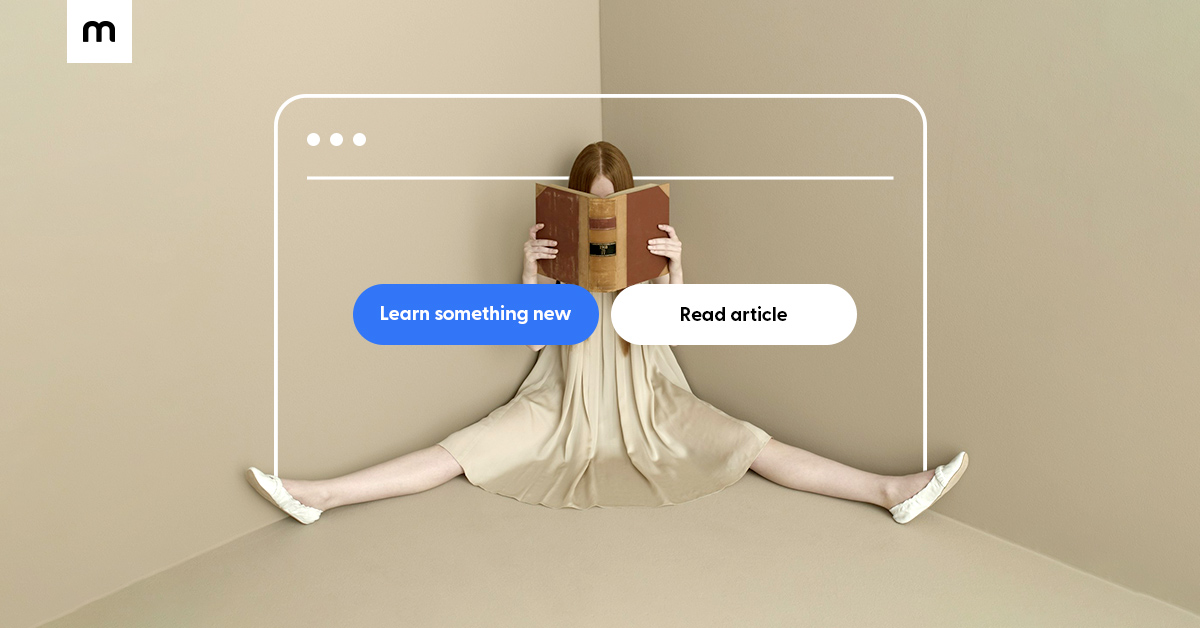
The one thing your website needs to skyrocket sales: clear CTA buttons
Among the simplest and yet most important features of your website are your call-to-action (CTA) buttons.
You will find those “Buy now”, “Subscribe”, “Sign-up”, “Get in touch” buttons on almost any website, but you might be surprised to learn just how critical they are for ensuring a seamless customer experience and their value in boosting your conversions.
In this article, we'll take a look at what are CTA buttons and why they're important for sales, as well as give you 5 CTA writing tips and a guide to using CTAs on your Mozello page.
Let's get started!
What is a CTA?
CTA stands for Call-to-action and, in marketing, a CTA is used to encourage a customer to take a specific action. You can find CTAs everywhere – on websites, advertisements, articles – and they can vary greatly depending on what kind of goal they're trying to achieve.
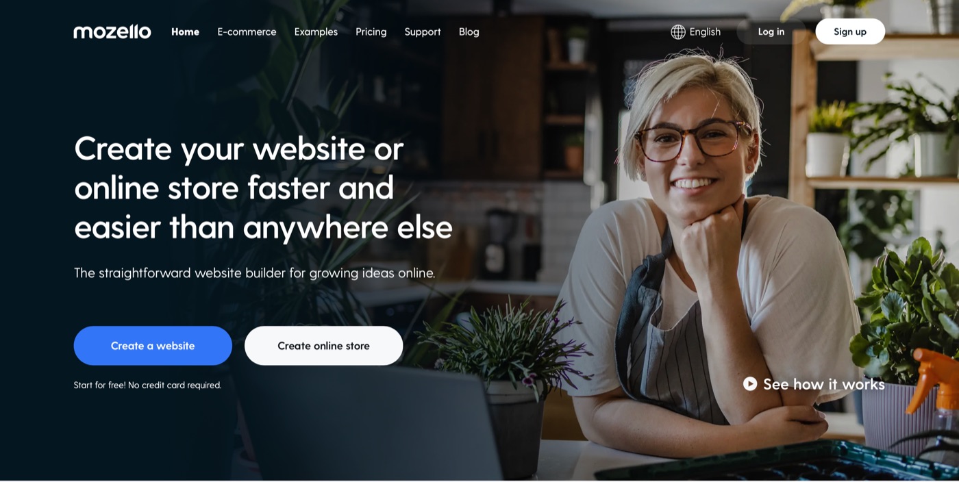
“Create a website” and “Create online store” are the main CTA buttons we use on our website
For example, an online ad for a clothing shop could have a “Browse the autumn collection” as a CTA, whereas a newsletter subscription form on a website will invite visitors to “Sign up now”.
In either case, the important part is that you're calling on a customer to take a specific action that's directly or indirectly conducive to your business goals.
Notably, CTAs don't exist in a vacuum. They're typically preceded by some content that entices the person to click on the CTA, such as ad copy or a nice visual.
Returning to our example – the clothing shop ad might have a picture of a stylish raincoat, with the CTA to “Buy now” underneath. Or the newsletter's CTA – “Sign up now” – might detail the benefits of doing so before-hand, e.g. “receive the latest discounts straight in your inbox”.
So, a more nuanced definition of what a CTA button is goes like this – it's what you want your customers to do after you've introduced them to your offer.
Why CTAs are critical for sales?
There are two reasons why CTAs are incredibly important.
Firstly, the obvious value of CTAs is to convert customers. A well-written and attractive CTA button begs to be clicked by sparking curiosity, offering an irresistible deal, or simply answering the customer's need. Accordingly, it can be the element that pushes them over the limit, turning a visitor into a customer.
On the flip side, a badly written CTA can confuse people or scare them away. For instance, if you sell jewelry and use “Decorate your neck” as a CTA, people might not understand what that means and what's going to happen if they click on that button – so they won't.
The second – and perhaps more important – reason how CTAs improve your sales is by providing a smoother user experience. CTA buttons guide the customer journey. They should provide a clear understanding of what to do next to customers interested in your shop.

Think of it as simplifying website navigation for visitors. They need to find what they want as quickly as possible and it's often the task of CTAs to help them get there.
As a business owner, you should have an idea of why people choose your products or services and what their purchasing habits are. So you must meet your customers' demands through CTAs.
Picture an online shoe store as an example. Some people will seek the latest fashion, others might be interested in specific types of footwear, others yet – the biggest discounts. Your homepage should have multiple blocks with respective CTAs that allow quickly and easily finding what they are looking for.
And the subpages, too. There should be clear CTAs throughout the entire buyer's journey that lead them to complete a purchase.
6 website CTA writing tips
It feels easy, almost intuitive, to differentiate between a good CTA and a bad CTA when you're given examples. But what are the underlying principles of a good CTA?
1. Give clear value
One of the most important elements of a CTA is that it should be simple to understand and tell the visitor what's going to happen if they click that button. In other words, you should avoid getting too poetic with your CTAs, as they can confuse potential customers and cost you a conversion.
Bad example: “Rediscover your passion for shoes”
Good example: “Browse men's footwear”
2. Use action verbs
Action verbs such as “get”, “buy”, “try”, “join”, “order”, and others typically outperform alternatives because they're motivating, clear, and energetic. This is why you'll find them in use in the CTAs of all of the biggest websites and e-commerce stores.
Bad example: “Applications are open”
Good example: “Join now”
3. Evoke emotion
While there are other emotions that can be helpful for conversions, the main emotion you should be evoking is a sense of urgency – a fear of missing out or FOMO. This can push a visitor that's just browsing to make a purchase for the sole reason that they feel that unless they buy now, they'll lose their chance at a good deal. Phrases such as “limited time offer”, “this week only”, and “flash sale” are often used to achieve this.
Bad example: “Don't miss out on the deal of a lifetime”
Good example: “Get shoes 50% off - this week only”
Note: make sure not to overuse these. If there's always a flash sale in your store, then your customers might become numb to it.
4. Use attention-grabbing design
Your CTA button should stand out. It should grab the attention of the visitor and make them want to click it, even if they're not THAT interested in what it is you're selling. For that, good copy is crucial, but so is an eye-catching design. Avoid trying to be too stylish with overly minimalistic CTAs, or placing them in an unexpected position.
When in doubt, know that a simple red button is irresistible.
5. Test your CTAs!
Don't be afraid to experiment with your CTAs. Changing them is easy and your particular audience might respond to one better than the other. Use one CTA for one week, and a different one the next – then compare results of how many clicks they've received.
For a more scientific and accurate approach, you should look into A/B testing tools.
6. ALWAYS include a CTA above the fold
This isn't so much a writing tip, as it is a website design one – but it's critical. In virtually all cases, you should have a button above the fold, which is the part of your website that your customers see before scrolling.
It's one of the most important parts of your website because it's the first thing a visitor sees when they visit your store.
You should start guiding them through the user journey immediately with a strong CTA, otherwise they might misunderstand your offer and leave.
Guide to using CTAs on your Mozello page
With Mozello anyone can quickly and easily create a website or an online store.
Building your homepage is very straightforward – you simply need to add blocks, which you can fill with content such as text, images, and products. In these blocks, you can then add buttons, which you can do in 3 different ways.
1. Adding buttons to a text block
Simply click on any of the text sections and a menu will appear, where you can click the plus symbol and select “Insert button”.
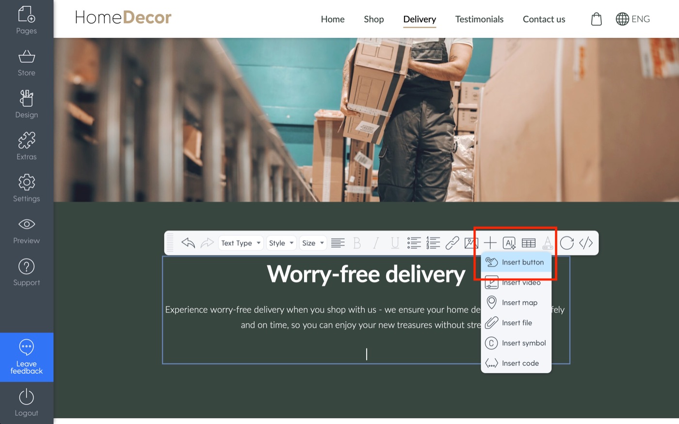
Now that you have your button, you can edit its style, placement, text, and where it links to. That's it!
Anywhere on Mozello where there's a text section, you can add a button this way.
2. Adding buttons to a banner block
A banner block – a big beautiful image with some text on it – can be a great way to catch visitor attention.
You can add a banner block just like we did with the text block previously. This time, simply choose “Banner” in the left-hand menu of the “Add content block” screen.
To add a CTA button to a banner block, you need to navigate to the block's settings, which you'll find under the gear icon located in the block's top-right corner. Then, you simply add the button or buttons by checking the “Primary/Secondary button” boxes.
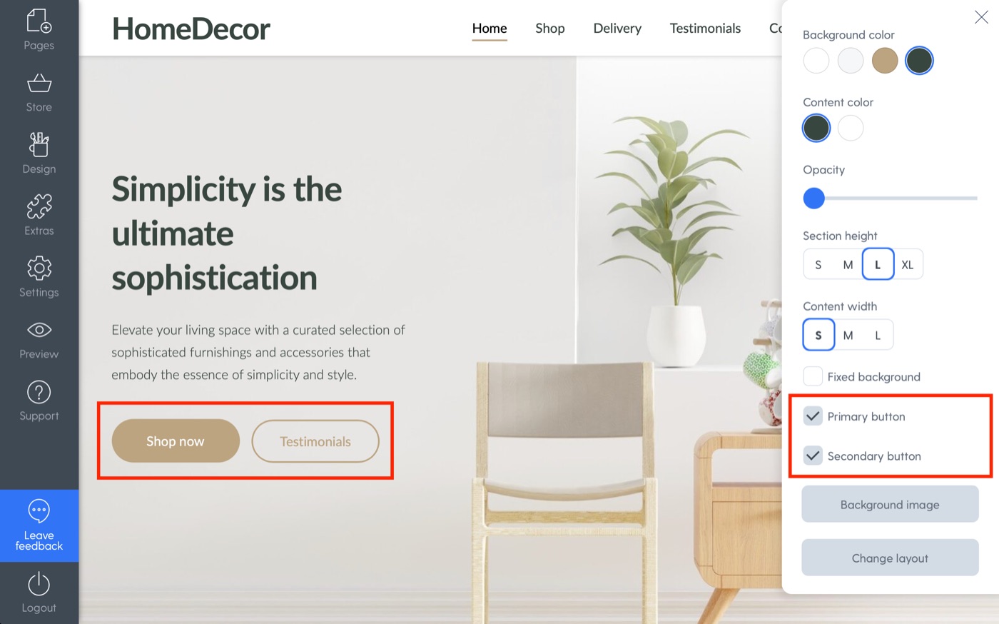
It's easy as pie. Just like before, you can customize the buttons to your liking.
3. Adding buttons to product blocks
Adding product blocks on your homepage is a great way to highlight the items you want to promote.
You know the drill – let's add a product block from the “Add content block” section after clicking the big plus in between your homepage sections.
We can add a button by once again navigating to the block settings in its top-right corner.

That's it! Or is it?
You can also add what we like to call “Action buttons” – those are buttons that appear under the product or category image, when you're showcasing products/categories. This can be done in the same place, but instead of clicking the “Footer button” box, you can simply choose one of the action button styles.
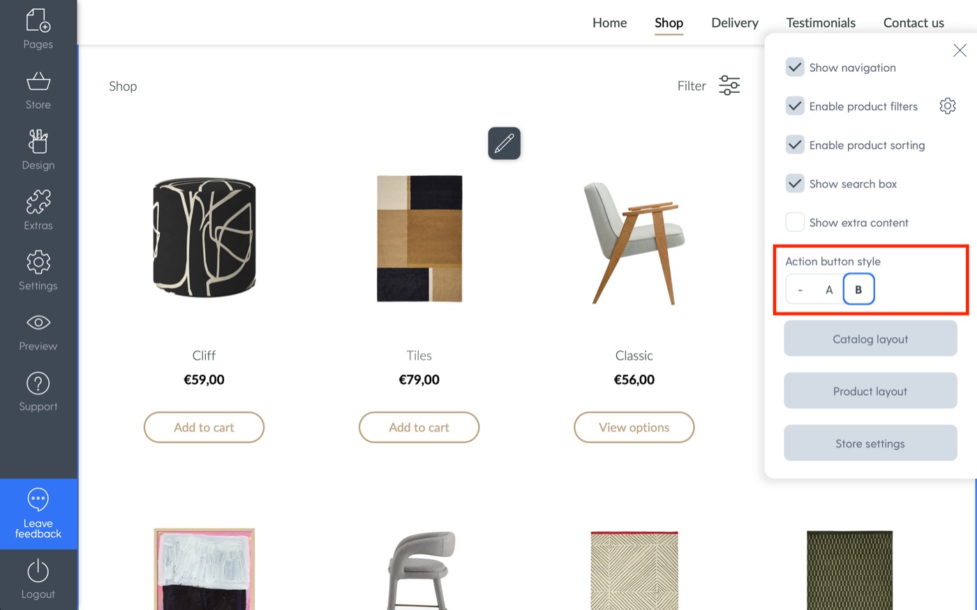
For categories, the action buttons will show up as “View”, whereas for specific products, they will offer the “Add to cart” option.
Start now!
Go take a look at your CTAs right now! Are they clear? Motivational? Attention-grabbing?
If not, change them.
It's super easy to do on Mozello website builder and improving these little buttons can help you massively boost your conversions.
So there's no excuse not to!