
ABCs of branding: How to design a memorable website

Brand design means your company name, logo, and website, right?
Not really.
Your brand design is your corporate image as a whole, including all your visuals, fonts, and even photos you post on your social media.
As you start designing your brand, your first task is to define your brand’s strategy, target audience, and how you want to address them. Your brand’s character - along with its design personality - should arise from these considerations.
When you’re sure about what you want to say to the world, follow these simple tips for a good-looking brand and website:
- Choose the right colors
- Design a memorable logo
- Pick a font that reflects your brand’s personality
- Use images that convey emotions
- Extra tips - simplicity, consistency, etc.
Choose the right colors
It might be tempting to make your brand all the shades of your favorite color.
Don’t do it.
Instead, do your research, get inspired by brands you admire (even in other industries) and make sure your colors are different from the competition.
No matter your industry or niche, make sure you stand out. Toms Rits, Designer at Nope.Company told us that the industry doesn’t affect a brand’s image as much as it used to. “For example, nowadays some banks use the color pink and expressive images. A few years back this might have been perceived as inappropriate.”
Don’t be afraid to choose vivid colors, if they don’t conflict with your brand and purpose. As the digital world grows and gets more crowded, lively colors are more likely to be memorable.
Some more tips to choose the right colors for your brand and website - without going overboard.
Stick to two colors max
Besides black and white, it’s advisable to choose no more than two additional brand colors. In most cases, three and more colors are excessive and will cost you a small fortune when you need to print in techniques that charge by the color.
Even if you feel you need more colors to represent yourself, never choose more than four to maintain a focused and recognizable palette. Use your colors consistently throughout all of your marketing materials to make sure your brand is recognized everywhere.
Pro tip: Your social media profiles will look much more professional if you stick to your color scheme across all your social platforms.
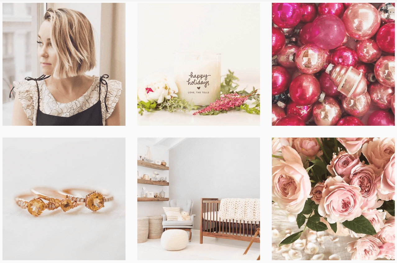
Designer @laurenconrad makes her Instagram feed look dreamy with muted pastels and tons of pink. She uses these colors with consistency thus staying true to her brand.
Respect the psychology of color
The colors you choose should be closely aligned with your brand’s personality.
Do you want your audience to feel reassured and relaxed or excited and passionate about your brand?
In general, warm colors will increase a feeling of peace and coziness while cold tones will seem more analytical and authoritative.
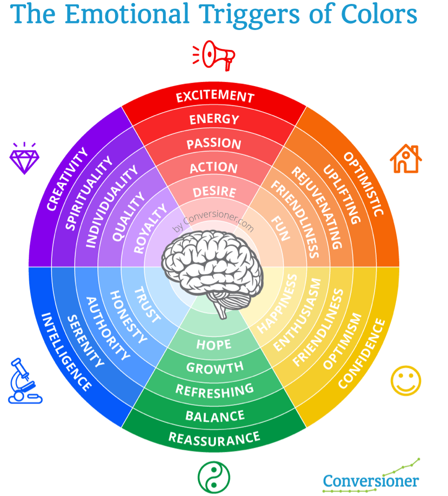
As you choose your brand’s colors, respect the emotions each tone conveys. Image Source.
Use contrasting colors
Contrasting colors - especially for the text and background - will make your website look attractive and make reading easier on the eye.
Vibrant images and a sprinkle of a contrasting color here and there (e.g. titles and buttons) will give a nice vibe and emotion to your site.
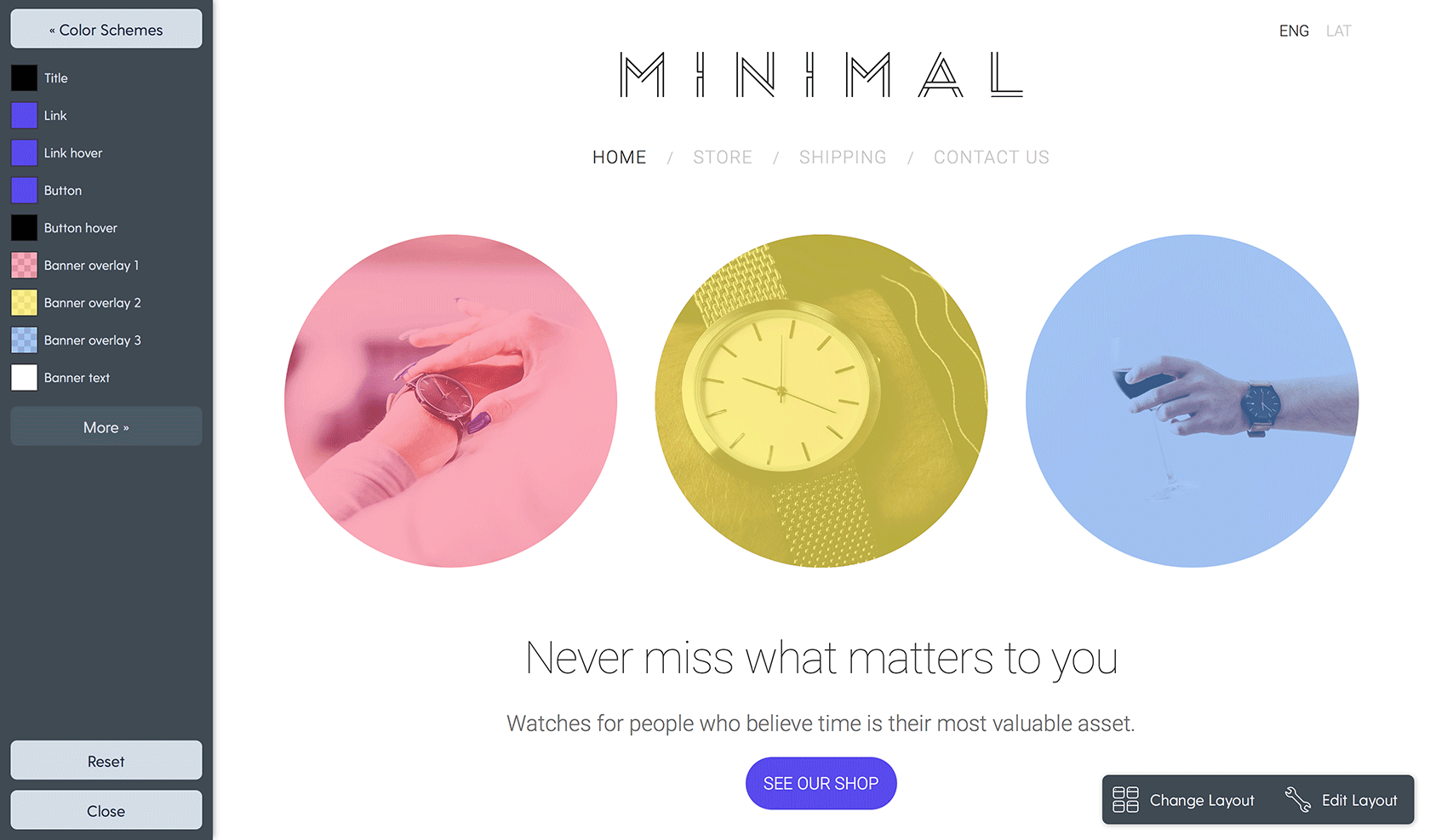
On Mozello, you can play with editing color combinations and adding contrasts like Button hover colors, Banner overlays, etc. If you’re not sure what to choose, go with the default settings for your chosen theme or experiment wish small tweaks to the pre-made design.
Leave plenty of white space
White space or negative space is a crucial element of design that’s often underestimated. And here’s why it’s also essential in branding:
- White space gives your website a modern, professional, and uncluttered look.
- It emphasizes the content on your site making it easier to perceive and read.
- White space adds a sense of superiority and elegance to your brand.
Design a memorable logo
Logo design is a science and an art at the same time.
Think about it:
You (or the designer you hire) have to create an icon that looks great in any size, on any media, reflects your business and is entirely unique.
Since coming up with a logo is so complicated and crucial, consider hiring a professional for the job. However, if you want to experiment or create initial sketches of your logo, try tools like Logojoy and keep these tips in mind.
Match your logo to your company
This may seem obvious to you, but many people still make the mistake of forgetting that the logo represents the company. Think about your company’s mission and the first emotions you want to evoke in your audience.
For example, if you sell baby products, don’t choose dark or cold colors for your logo. If you organize extreme sports events, make sure your logo reflects the excitement and adrenaline both in colors and visuals.
Red Bull’s logo depicts strength, speed and even aggressiveness - emotions that match the product itself, namely - energy drink. The strong colors contribute to this vibe.
Stand out
Make sure your logo isn’t too similar to another company’s. This may happen unintentionally, so, before launching, ask your friends and acquaintances to comment on several variations of your logo.
Pick a font that reflects your brand’s personality
The typeface you choose influences how your brand is perceived by the world.
Even if there isn’t a strict rulebook that says which fonts should be used in particular industries, each style of fonts represents a specific vibe and emotion.
Follow these tips to make sure you choose the right typeface for your site and marketing materials.
Match the font with your brand’s character
Consider whether your brand would be best represented with a font that’s playful or formal, bold or sophisticated. If you’re not sure, go with classic fonts that won’t let you down, like Arial or Georgia.
For example, geometric fonts with homogenous proportions suggest design purity and simplicity. If these are values you want your brand to represent, choose these fonts.
On the other hand, if you are a design or fashion brand, consider using serifs or fonts with curves or hairline strokes.
To make the task of choosing fonts easier for you, Mozello offers pre-made font schemes that already look great together - you just have to choose the overall vibe that you like.
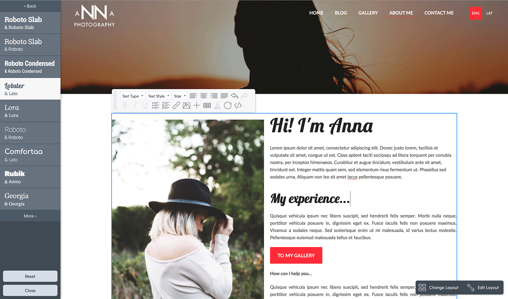
You can go for a playful font scheme like Lobster & Lato:
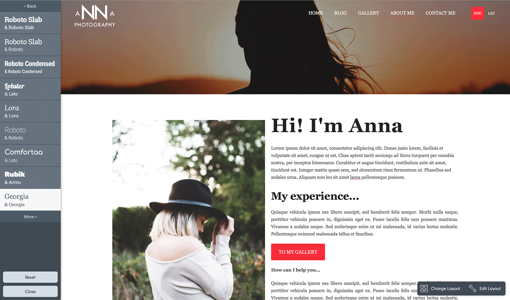
A more classic font like Georgia:
Or, one of many other good-looking font combinations.
Use the same fonts everywhere
When choosing your brand’s typeface, think about all the channels where it will be used. Apart from your website, will you also create presentations or printed materials like leaflets or business cards? Be sure to use the same fonts in all your marketing channels.
If the web is your primary channel, consider using Sans Serif fonts (fonts without decorative strokes) such as Arial or Open Sans that are easier to read online.
Use images that convey emotions
At first, you might not think that images are a part of your brand. However, professional visuals in your brand’s style and colors go a long way in conveying your company’s personality and message.
Designer Toms Rits adds that even the elements inside the images - such as the emotions of people depicted - are a part of a brand’s design.

Spotify with its colorful gradient pictures is an excellent example of how a brand can be recognized by its brand visuals. Image Source.
Some tips for images that will convey your brand personality:
- Choose high-quality visuals - If you don’t have professional photos on hand, consider buying stock photos to improve the look of your website.
- If you sell tangible products, invest in a photo shoot with a professional photographer.
- Consider using infographics and videos - especially if your product or service is technical or otherwise complicated.
- Use your customer’s photos - invite your followers to contribute, e.g., send pictures where they use your product. Adding an identical filter to all your photos will create a harmonized, yet dynamic style to images that come from different sources.
Follow these extra tips
Be simple
This tip applies to everything from fonts to images and colors. Notice that some of the largest companies use very simple branding that’s easy to recognize, and clean.
Be consistent
It's important to use all your brand elements consistently everywhere your brand appears. This way you’ll achieve immediate recognition and a positive perception of what’s unique to you and your brand.
Be personal
People love to interact with brands that evoke emotions. Find a way to connect with your customers on a deeper, more emotional level. Use visual emotional triggers to strengthen your relationship and foster loyalty.
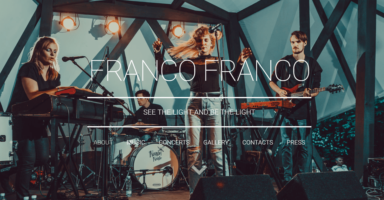
Band Franco Franco have chosen a website header image that conveys the emotions they feel on the stage. This dynamic photo of a band in action leaves a much more profound impact than a static, impersonal picture would. Image Source.
Wrap up
To sum everything up - your brand design cannot exist before your brand has a personality.
Designer Toms Rits explains: “Decide if your company is more creative or analytical. Practical or a source of inspiration. Passive or active. Conservative or innovative. Extrovert or introvert.
Once you’ve got answers to these questions, all your design decisions - like colors, fonts, and visuals - will have reasoning and will work together more efficiently.
This also works in reverse - when you see a good brand, you should need no explanation about what it does and what its personality is.''
Thinking about where to start?
Head over to Mozello and build your brand’s website on top of trendy sample designs that can be fully customized.