How to create an online store that boosts sales: The power of clear CTA buttons

Among the simplest yet most powerful features of your website are your call-to-action (CTA) buttons.
Those little “Buy now”, “Sign up”, or “Get in touch” buttons might look ordinary, but they can make or break your sales. Whether you want to create an online store, build a personal blog, or make a business website, CTAs are essential for guiding visitors and turning them into paying customers.
In this article, you’ll learn:
- What CTAs are and why they matter.
- How they directly impact your sales.
- 6 tips for writing effective CTAs (with good and bad examples).
- A step-by-step guide on how to add CTAs to your Mozello site.
Let’s dive in!
What is a CTA?
CTA stands for Call-to-Action. In simple terms, it’s the element that encourages your website visitor to take the next step. CTAs appear everywhere—on ads, banners, product pages, and even blog articles.
For example:
- An ad for a clothing shop might include: “Browse the autumn collection”.
- A newsletter signup form could say: “Subscribe today and never miss a discount”.
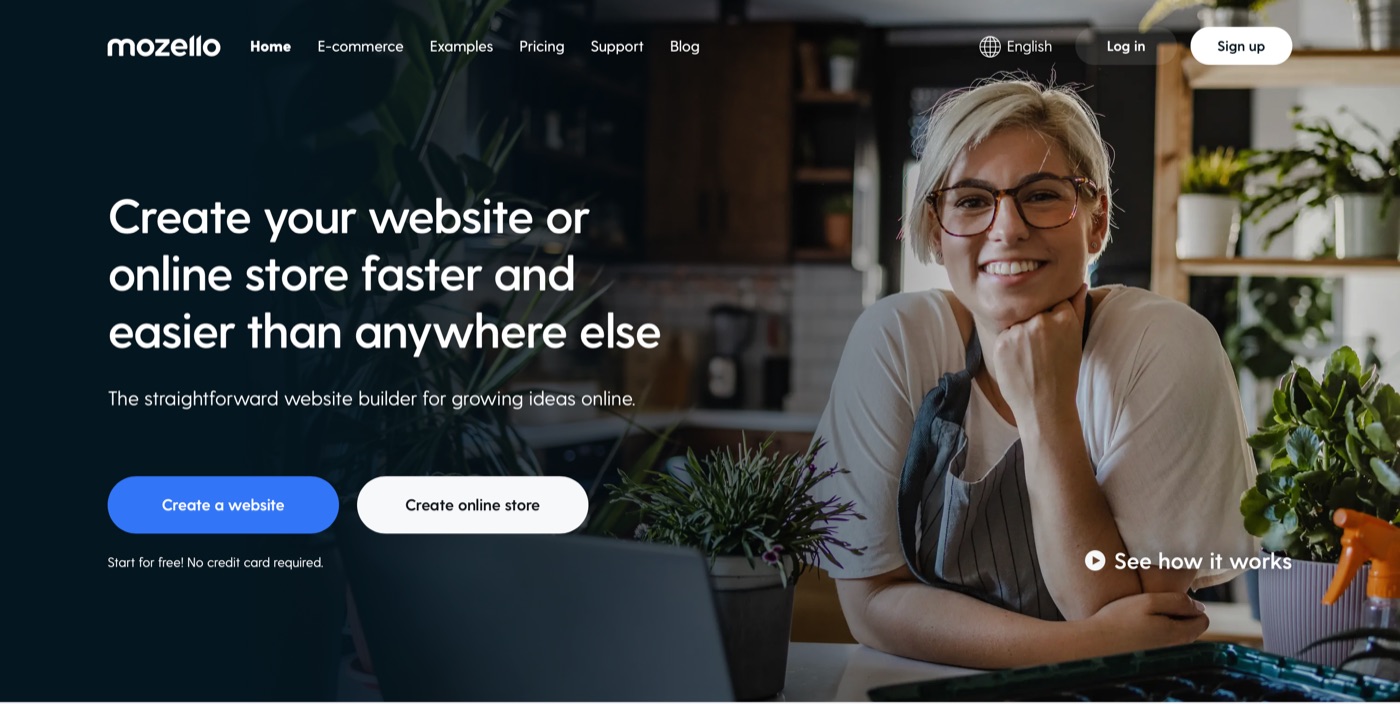
On Mozello, the main CTAs you’ll see are “Create a website” and “Create online store”, since that’s exactly what most of our users come here to do.
The magic of a CTA is that it doesn’t stand alone—it’s always connected to compelling content. A photo of a stylish raincoat followed by a “Buy now” button works better than a button on its own. Similarly, “Sign up now” performs better if paired with benefits like “Get exclusive deals delivered to your inbox.”
In short: a CTA tells your visitor what to do next once you’ve caught their attention.
Why CTAs are critical for sales?
There are two big reasons why CTAs are vital to anyone learning how to create an online store or how to build a website:
They increase conversions.
A strong CTA sparks curiosity, creates urgency, or offers an irresistible deal. It’s often the final nudge that turns a casual visitor into a paying customer.
Bad example: “Decorate your neck”
Good example: “Shop elegant necklaces”
They improve the user experience.
CTAs act like road signs, guiding visitors through your ecommerce website. Without them, customers can get lost or frustrated. Imagine an online shoe shop: one visitor looks for the latest sneakers, another for hiking boots, and a third for clearance deals. Without clear buttons like “Shop sneakers” or “See discounts,” they may give up.
If you want to know how to start an online store successfully, you need to think of CTAs as navigation tools. They should be present across your homepage, product pages, and checkout flow.
6 CTA Writing Tips (with Good and Bad Examples)
It might seem easy to recognize a weak CTA when you see one, but crafting high-performing call-to-actions requires strategy. Think of your CTA as a handshake between your content and your customer—it must feel clear, confident, and motivating. Here are six detailed tips to help you write CTAs that actually get clicked, whether you want to create a website, create an online store, or scale your ecommerce business.
1. Give clear value
Your visitors shouldn’t have to guess what happens when they click. If your button text is vague or overly creative, you risk losing them. Instead, spell out exactly what they’ll get.
Bad example: “Rediscover your passion for shoes”
Good example: “Browse men’s footwear”
Why it works: The second example removes confusion and tells the user exactly what they’ll see next. This principle applies to any kind of website creation project—whether you’re trying to build a website for your portfolio or create an online store for your business.
2. Use strong action verbs
CTAs that start with energetic, commanding verbs tend to convert better because they inspire movement. Words like buy, join, get, order, start, try create momentum.
Bad example: “Applications are open”
Good example: “Join now”
Why it works: “Applications are open” is passive, while “Join now” feels like an invitation. Action-driven CTAs are essential when learning how to create an online store, because shoppers expect simple, direct instructions.
3. Evoke emotion and urgency
Humans are emotional buyers. If your CTA triggers excitement, curiosity, or even urgency, you increase the chance of conversion. That’s why phrases like “limited time offer”, “this week only”, or “last chance” are common in ecommerce website development.
Bad example: “Don’t miss out on the deal of a lifetime”
Good example: “Get shoes 50% off – this week only”
Why it works: The bad example sounds exaggerated and unrealistic. The good example is specific, time-bound, and credible—perfect for motivating hesitant buyers in an ecommerce website builder environment where quick decisions matter.
4. Make the design pop
Even the best CTA copy won’t convert if nobody notices it. Your button must visually stand out from the rest of the page. Use contrasting colors, bold fonts, and enough white space around it so it doesn’t get lost.
Bad example: A grey button that blends into the background.
Good example: A large red or green button placed directly under the product description.
Why it works: Users scan web pages quickly. A button that visually “pops” signals action, especially in online stores where shoppers want clear next steps like “Add to Cart” or “Create an account.” If you’re exploring how to start an online store, this is one of the first design lessons to learn.
5. Test and optimize regularly
There’s no universal formula for the perfect CTA. What works for one business may not work for another. That’s why testing is crucial. A/B testing tools allow you to compare variations of text, colors, and placement to see what gets the most clicks.
Example A: “Get started for free”
Example B: “Start your free trial today”
Why it works: Even small tweaks can make a big impact. For example, replacing “Submit” with “Get my free guide” can significantly increase signups. Over time, testing helps refine your website creation process and ensures your ecommerce website development efforts produce better results.
6. ALWAYS include a CTA above the fold
The “fold” is the part of your website visitors see before scrolling. If your CTA is buried too far down, many people won’t even reach it. Always place at least one strong CTA above the fold to immediately guide users.
Bad example: A button hidden at the very bottom of a long homepage.
Good example: A bright “Shop New Arrivals” button featured right under your banner image.
Why it works: Attention spans online are short. Visitors should instantly know what you want them to do—whether that’s to buy, subscribe, or start building their store. For anyone researching how to start an online store, positioning CTAs above the fold is a must-have tactic.
With these six principles, your CTAs can transform from “just buttons” into powerful tools that increase engagement, improve navigation, and boost sales—whether you’re building a personal blog, developing a professional site, or learning how to create an online store from scratch.
Guide to using CTAs on your Mozello page
With Mozello, it’s easy to build a website or create an online store and add CTAs wherever you need them.
Building your homepage is very straightforward – you simply need to add blocks, which you can fill with content such as text, images, and products. In these blocks, you can then add buttons, which you can do in 3 different ways.
1. Adding buttons to a text block
Simply click on any of the text sections and a menu will appear, where you can click the plus symbol and select “Insert button”.
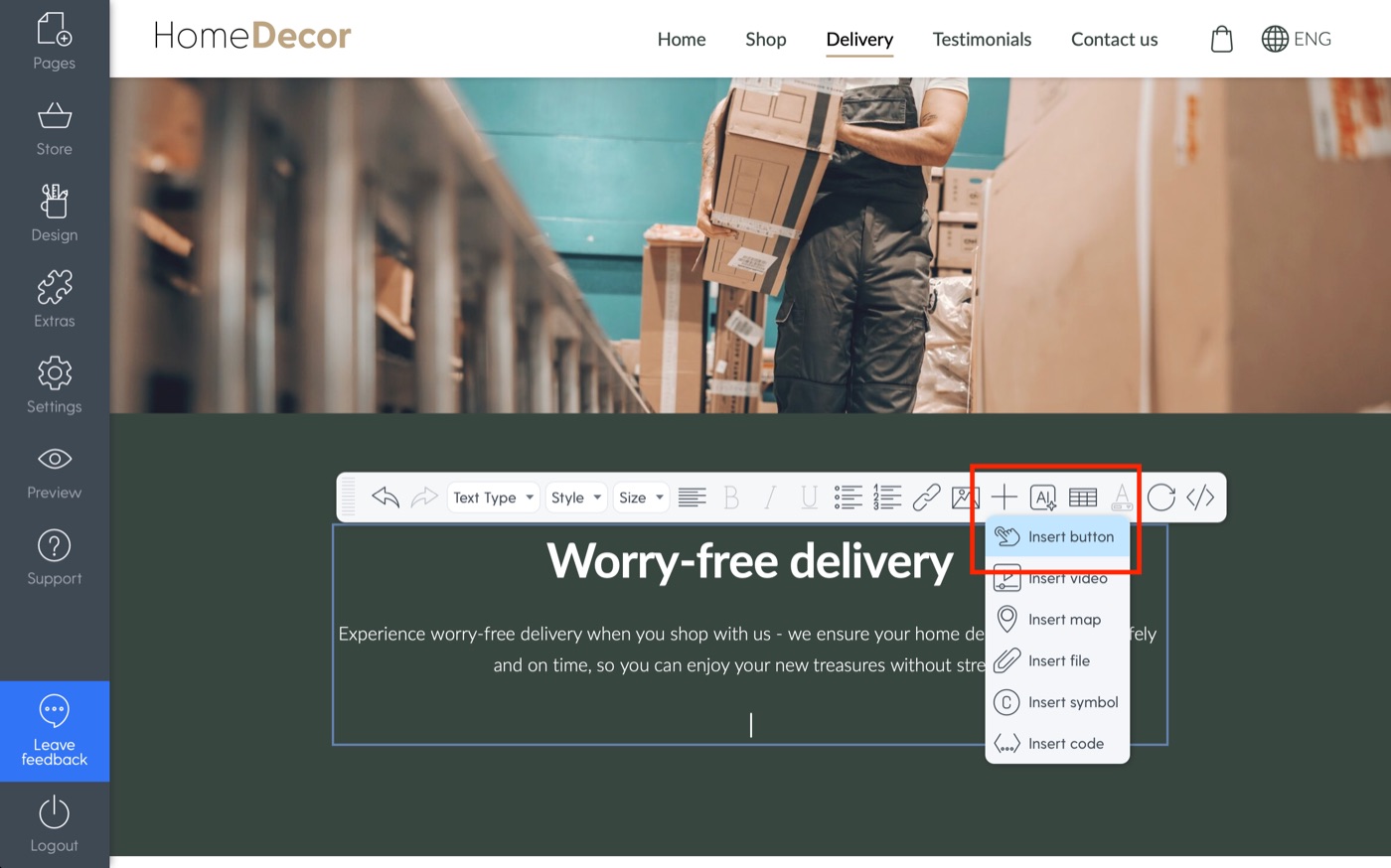
Now that you have your button, you can edit its style, placement, text, and where it links to. That's it!
Anywhere on Mozello where there's a text section, you can add a button this way.
2. Adding buttons to a banner block
A banner block – a big beautiful image with some text on it – can be a great way to catch visitor attention.
You can add a banner block just like we did with the text block previously. This time, simply choose “Banner” in the left-hand menu of the “Add content block” screen.
To add a CTA button to a banner block, you need to navigate to the block's settings, which you'll find under the gear icon located in the block's top-right corner. Then, you simply add the button or buttons by checking the “Primary/Secondary button” boxes.
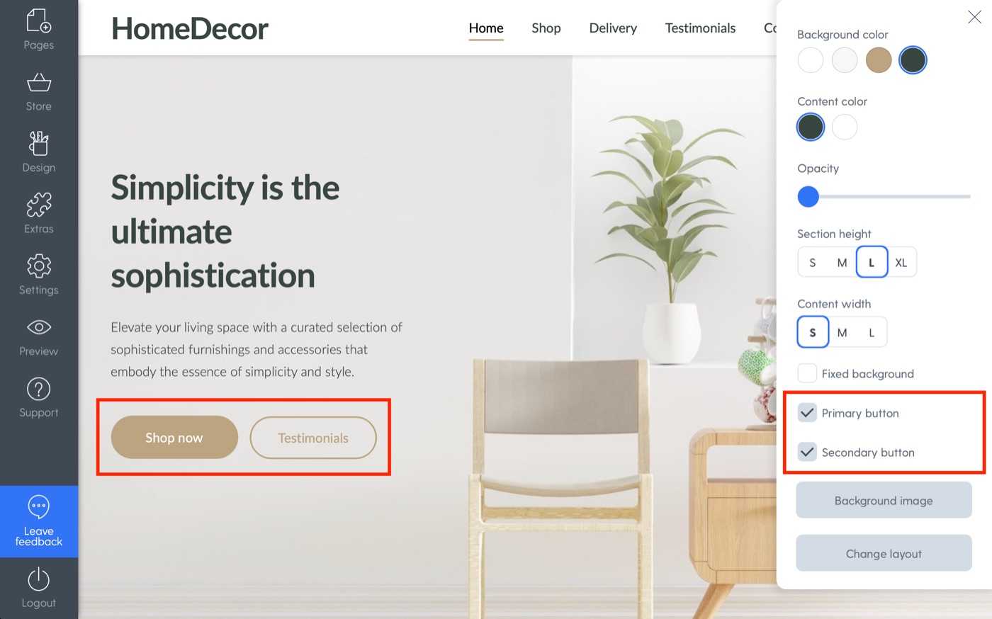
It's easy as pie. Just like before, you can customize the buttons to your liking.
3. Adding buttons to product blocks
Adding product blocks on your homepage is a great way to highlight the items you want to promote.
You know the drill – let's add a product block from the “Add content block” section after clicking the big plus in between your homepage sections.
We can add a button by once again navigating to the block settings in its top-right corner.
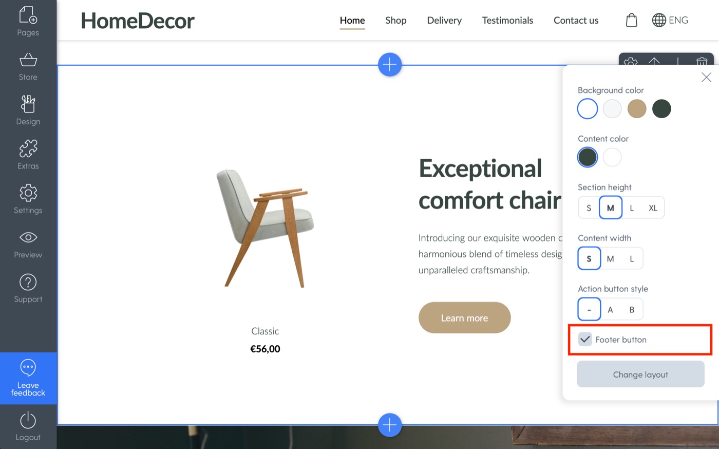
That's it! Or is it?
You can also add what we like to call “Action buttons” – those are buttons that appear under the product or category image, when you're showcasing products/categories. This can be done in the same place, but instead of clicking the “Footer button” box, you can simply choose one of the action button styles.
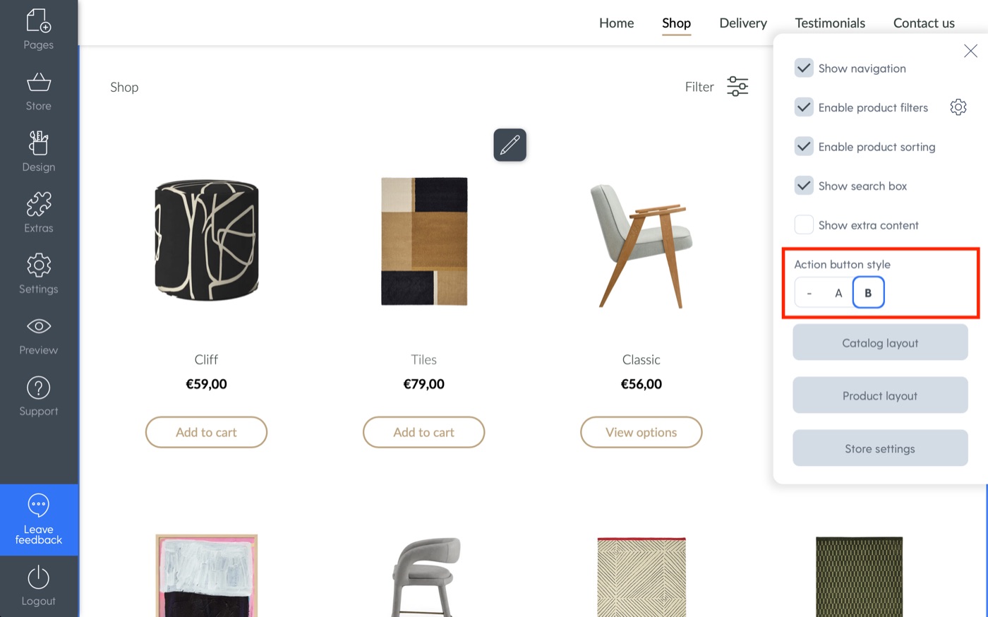
For categories, the action buttons will show up as “View”, whereas for specific products, they will offer the “Add to cart” option.
Start Now: Create Your Online Store with Mozello
Strong CTAs are the missing ingredient in many websites. They improve user experience, highlight your offers, and most importantly—boost sales.
So ask yourself: are your CTAs clear, engaging, and motivating? If not, it’s time to update them.
With Mozello, you can create a website, build an online store, and design effective CTAs in just a few clicks. No complicated ecommerce website development needed—just an intuitive, beginner-friendly platform.
Start today with Mozello and create your online store that sells.
