
From colors to buttons: the 5 pillars of design and how to get them right

In the previous articles, we introduced you to the key features you need to know to build your Mozello website or manage your e-commerce store.
In this one, we'll talk about design.
Website design is extremely important because good design helps you convert visitors into customers by:
- Leaving a positive impression on your customers,
- Helping them intuitively navigate your website/store,
- Boosting your branding efforts and fosters trust.
You can have the best products/services and prices, but, unless your website is well-designed, your visitors simply won't trust you or won't be able to find your offerings.
Luckily for you, Mozello's professional templates take care of the hard visual and technical stuff. Make sure to take your time in choosing the right template for your website.
That said, you still need to put in some work designing and personalizing your website by:
- Ensuring the layout is well-structured and easy to understand,
- Making navigation intuitive with clear call-to-action buttons,
- Providing information in easily digestible bites with short and punchy text,
- Giving your brand an identity with the help of the right fonts and colors,
- Using high-quality images that capture visitor attention.
Let's take a look at each of these design elements and how to get them right.
1. A structured layout is easier to understand
One of the main goals of your website should be to help your visitors find what they're looking for as quickly as possible. In the previous article, we learned how to add content blocks to your Mozello website, but you should pay attention to their arrangement.
Ensure your layout flows logically, presenting information in a sequence that feels intuitive. Key elements like your products or services should be placed in easily noticeable sections, whereas less “urgent” content should appear lower on your page.
How do you evaluate the “urgency” of different types of content? It depends a lot on your industry, service, product, buyer profile, and more, but one simple way to think about it is – what you need to show the customer to convince them to buy.
Imagine you're running a shoe e-commerce business. Your products are the first and most important thing you should display. Next, you might have a section proving the quality of your products detailing how they're made and from what materials. Then you might want to show that they're stylish to wear with some pictures of people sporting your products, and so on.
How you structure your layout depends on your industry and buyer persona.
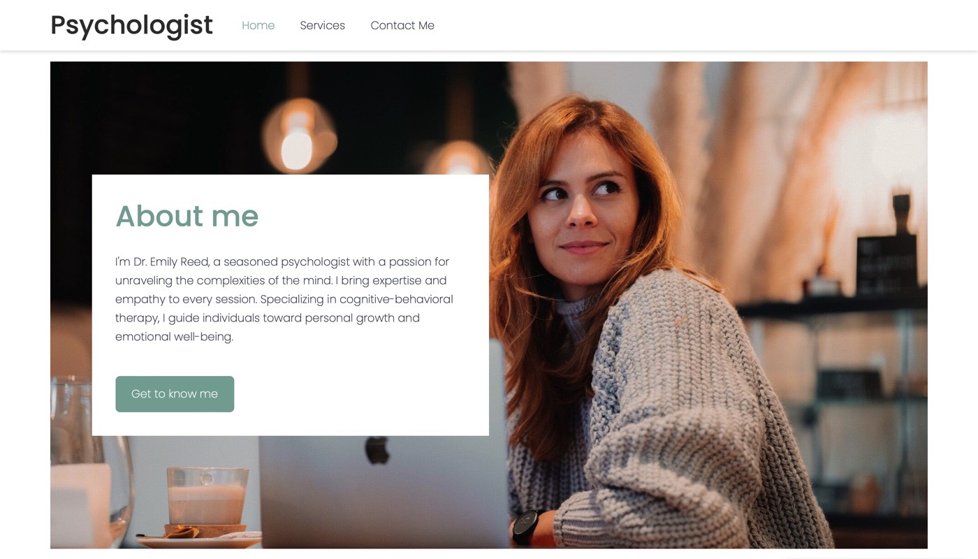
For example, many business owners include an “About us” section on their homepage. If you're running a digital shoe store, then who you are might be less important to your customers (and place it at the very bottom of your page), than if you were a psychologist, where your reputation and experience are key – in the photo above, this section was placed immediately after the fold.
2. CTAs help your visitors find their way
Call-to-action (CTA) buttons like “Buy now”, “Sign up”, or “Learn more” are critical, must-include components of your website. They're more than just buttons – they're guideposts that not only allow visitors to easily navigate your website and quickly find what they're looking for, but also bring them closer to the ultimate destination, namely a conversion.
As the website & business owner, it's your goal (and in your interests) to help visitors get there and you can do that by using CTAs throughout your website.
Without a CTA, a visitor might scroll through your website, read your text, look at your images, and then be left wondering – what next? By not including CTAs (and it’s a common mistake!) you’re making it more difficult for visitors to find what they need and reducing your chances of turning them into a customer – a lose-lose situation.
That’s why you should use CTA buttons abundantly. They should be clear, concise, stand out, and nudge your visitors to take a specific action.
Explore the ins-and-outs of CTAs, discover 6 actionable CTA writing tips, and learn how to add CTAs to your Mozello page in this easy-to-follow article.
3. Text – keep it short & simple
When it comes to text in the online world, less is more.
People rarely have the time or patience to read big blocks of words, so you should generally try to use short and punchy text, breaking it down into easily digestible bites, especially on your homepage. If you want to share extra information, you can, for example, write it up in a blog post or on a separate page and lead your visitors there with a “Learn more” CTA.
A key element of delivering information effectively is the formatting. By using headers and subheaders, you can create a visual hierarchy that helps visitors quickly orient themselves on your website as well as absorb the most important information, keeping them engaged and satisfied.
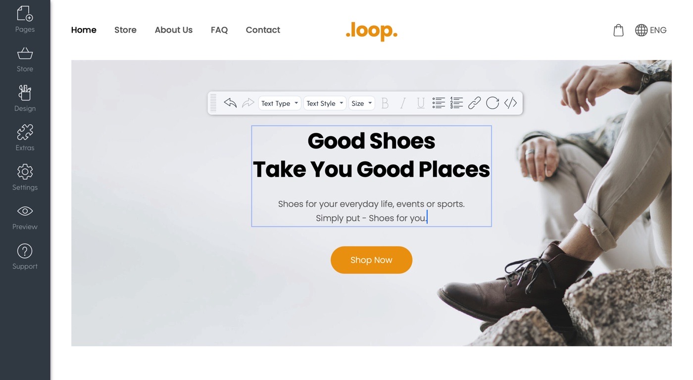
Like in the image above, a very common structure for a section's text is Heading -> Description -> CTA.
Formatting can help with information organization in other ways too. For example, you can use bulletpoints to get more info across using fewer words. Or bold certain words or sentences to highlight their importance, though you should do this sparingly, otherwise your text will look like a zebra and a reader won't be able to tell what's important and what isn't.
Find some extra tips on text formatting here.
4. Colors and fonts give personality to your website – make sure it's the right kind of personality
Colors and fonts play an important role in how your visitors perceive your website, your brand, and your identity. You might be inclined to just choose your favorite tones and styles, but that's not necessarily the best idea.
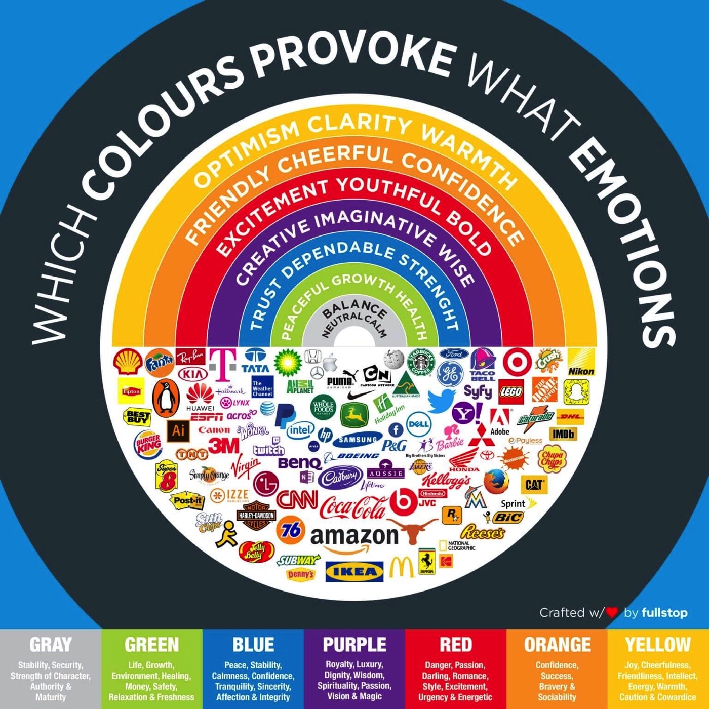
The purpose of colors and fonts is to evoke a certain atmosphere – to create an ambiance that makes visitors feel a certain way. This isn't easy. You need to understand color pairings, avoid using too many colors, and understand how colors make people feel. Fortunately, Mozello understands the significance of this and offers ready-made color schemes designed for visual harmony.
But you still have the most important task of choosing the schemes. For this, consider the psychology behind colors. Warm tones can radiate friendliness, while cool hues convey professionalism. It's a good idea to explore leaders in your industry and observe how they use colors (and fonts!) to enhance their digital presence.
Learn more about colors, fonts, and business branding in this article.
5. Enhance the visitors' experience with high-quality visuals
They say a picture is worth a thousand words and this holds true for your website as well. Images breathe life into your page, making it more attractive and evoking emotions. But only relevant high-quality ones! If you have random, pixelated photos, all that's going to do is confuse the visitor and make them question the quality of your offering.
Relevance
You need to choose visuals that fit in with the themes and narratives of your website and its visitors. To find a suitable picture, consider how it relates to your brand, to your chosen color palette, to the price point of your products, to the message you want to send, what emotions it evokes and are they in tune with how the rest of the website feels.
Unless you take all these points into consideration, your chosen visuals risk being disruptive to the overall experience – users will be able to tell that they're just random stock photos and may grow to distrust you.
Quality
Free stock photo websites make it easy to find professional visuals for every occasion and industry. Always opt for larger-sized photos, so that they look great on every display size, but make sure to optimize their file size, because larger images take longer to load (and you want your website to load as quickly as possible!). You can do this with free tools like TinyPNG that compress the image without affecting its quality too much.
If you're selling products, you should pay extra attention to the product photos as they can directly influence a purchasing decision. Check out this detailed beginner guide for taking incredible product photos at home.
Design matters, so make it count
When it comes to design, there's no single “correct” way to do it. It's important to take your time and try out different approaches and styles. But don't worry – you don't have to create the perfect design right away.
With Mozello, you can easily edit and change things at any time, so don't hesitate to regularly update your design. The best way to find out what you should update is to simply ask your customers – was there anything they struggled with? Were they able to find all the information? Did they like the style of the website?
If you're just getting started and don't have customers to ask, getting a second opinion from friends and family can be just as valuable (though always take them with a grain of salt).
Any other questions? Mozello offers a healthy knowledge base with mini video guides, comprehensive step-by-step guides, and frequently asked questions you can explore to find your answers, as well as an informative blog to learn from.
Still have questions? Our friendly support team is here to help! Get in touch with them here and they'll help you quickly resolve any issues or challenges.